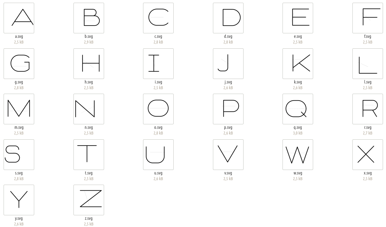
Belgica-Belgika
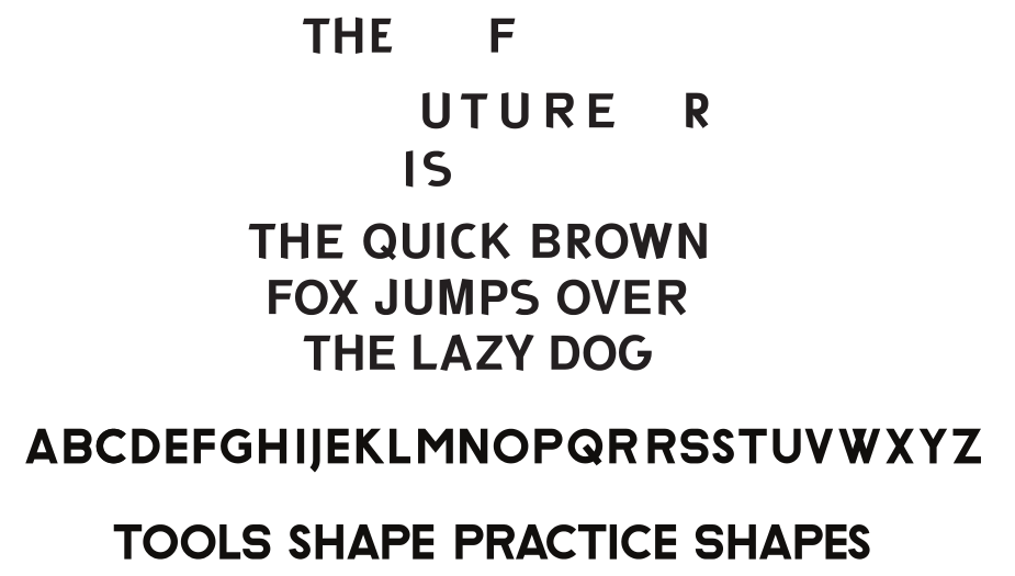
Stroke fonts with no contrast and capital letters only based on diverse pseudo-generic elements for multi-usages.
Direct links to download the fonts:
For the sources files and explanations about the production, browse below.
Historical background (version française ci-dessous)
Before the appearance of typography around 1450 in the West, writing experience was in contrast an extremely varied practice (between the fast caroline of the scribes and the capital engraved in Roman marble) and unified around the line and its ductus. The punch that began to draw characters by their edge (their outside) in hard materials intended to produce lead letters in series introduced an indirect way of understanding the letter. And so, for over five centuries, typography has been kept industrially separate from writing. Since the genesis of digital typography, this separation has been maintained organically, partly by the reverence of the typographers' lodge, which feels itself to be the repository of a very long tradition, partly for the convenience of the major software publishers, who are also grappling with the appalling task of managing the still unresolved management of the many writing systems existing in the world.
This broad majority movement has been marked by a few separate initiatives. Four particular cases seem interesting to describe.
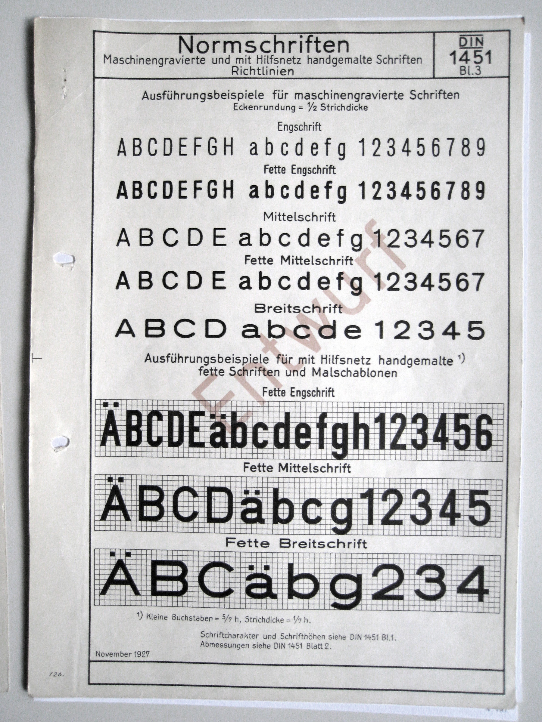
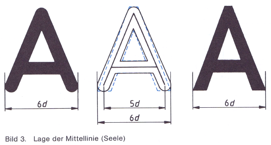
One of the first reconstruction movements in industrial Germany after the First World War was the establishment of the Deutsches Institut für Normung (DIN). And when, in the mid-twenties, it was a question of describing a standardized writing system, it was by means of a line and on a grid that the German engineers tried to put together the ethos of each letter in a coherent manner. For these toolmakers, the thickness of the line is defined by the tool which traces, the line by its center, the typography of the edges produced is thus a local artifact, thus perpetuating three millennia of human writing. This standard is therefore subject to all kinds of variations according to needs, more or less described in the standard plates, and remains largely to be deduced on a case-by-case basis by the common sense of its users.
In the 1960s, when it appeared that CNC machines were beginning to be introduced at the US Naval Weapons Laboratory, the DR. Hershey implements a series of instructions allowing simple letter engraving for industrial marking and the first vector-based digital displays. Far from the typographical context, this instruction game circulates freely without too restrictive license, and is progressively implemented in many civil industrial applications. An incalculable number of elevator name plates are engraved with letters drawn by the American army.
At the end of the seventies, mathematician Donald Knuth was dissatisfied with the typographical treatment of his equations and decided to set up an entire composition system, TeX, to publish his works "The Art of Computer Programming" still in writing today. Confident in being able to digitally construct the antediluvian link between typography and mathematics, Knuth describes algorithmically the Metafont format intended for use in TeX. And it is mainly through the central ductus that Metafont traces his letters and signs. Using only code without direct visual support, the format is feared or avoided for a long time by typographers. The scientific world and him alone uses since the TeX system with mainly the only fonts proposed by its creator, and that without particular concern...
At the end of the eighties, Adobe, after having set up the typographic standard called Type 1 and still at the base of the current standards, ventured to introduce Type 3. This format allows to store in each glyph (visual space describing a letter in a font) any type of object. This includes simple lines, open or not, rather than a strictly closed contour. This allows some typographers to introduce fonts built according to a vector drawing principle similar to writing. But the opening of the format, allowing the inclusion of any type of object, tends to saturate the still very limited memory of the processing units of the printers of the time. And a reputation of insecurity quickly removes Type 3 from circulation by Adobe, which does not want to take any risk of reliability of the solutions proposed by it at the very moment when Apple and Microsoft attack it with the Truetype format competitor of Type 1.
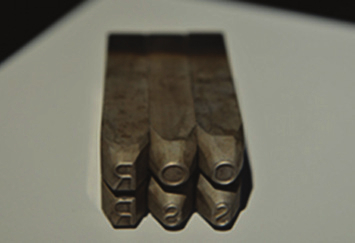
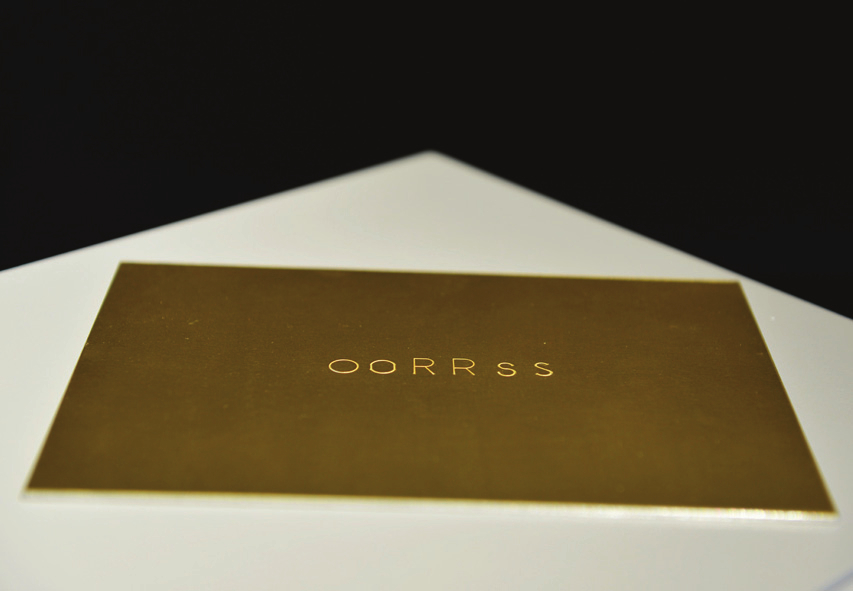
Hacking - By mixing these four experiences without any hierarchy, the OSP (Open Source Publishing) collective follows a traverse path to regularly bring this stroke fonts issue back to the middle of the table. Thus a double alphabet is drawn by modular elements in a drawing software, at a distance from typographical practices. The letters each take two different forms to support their relationship with the writing where the appearance of each letter can be adapted according to the visual influence of its neighbors. A spiral and recursive visual experiment with another type of deformation that these shapes produce. Elsewhere, a hack modifies the automatic closing of fonts considered by the Scribus layout software as an error but voluntarily introduced to produce line fonts. Further on, the line is used at the essence of its non-thickness to produce the sinuous blade of the punches that strike the letters ORS on brass plates. Or these projects of covering works to appear where the line is multiplied by the thickness on superimposed letters. The line is interrupted again by an algorithm to allow the automatic creation of monograms for a social media in preparation. The line always, at the time of its appearance, temporarily frozen by effectiveness for a font to be used according to standards by a third in Italy.
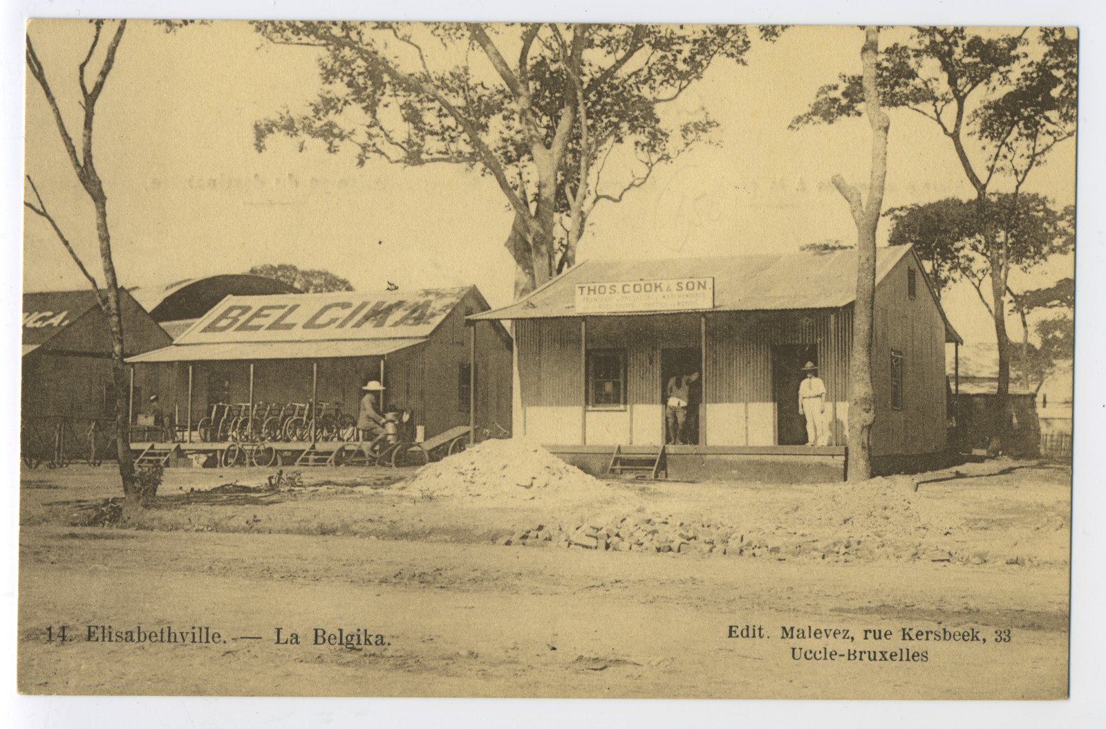
Return to Belgika - The owner asks for it, it takes a big Belgika on the roof of this barrack, to mark the place. The engineer traces the seven letters on a sheet of paper and dimensions them. Someone, or perhaps both, painted each letter with some care. A wheelbase is added to the G to give it a kind of balance. The grease of the central bar of the B hesitates and the spacing is a little too mechanical but the result does not lack elegance. When a postcard immortalizes the alignment of the bikes under this Elisabethville awning some time later, the contrast of the letters, even at an angle, is well marked.
How to fold these sums of experience to lead them to superimpose forms.
Context
The Belgica cluster started without a name in parallel of the Belgika project. Multiples tracks questioning the relationships between writing (schrift), lettering and typography practices through digital tools are crossing. The OSP caravan (Open Source Publishing - http://www.osp.kitchen) is following diverse tracks that insist on stroke fonts, and its very specificities. Some could be listed here by chronological order.
- Polish road signage W drogę is drawn collectively based on photos collected on the way to Libre Graphics Meeting in Wrocław in 2009. Three tactics are compared : by autotracing, by drawing the contour, and by geometrically drawing centerline. http://ospublish.constantvzw.org/foundry/w-droge/
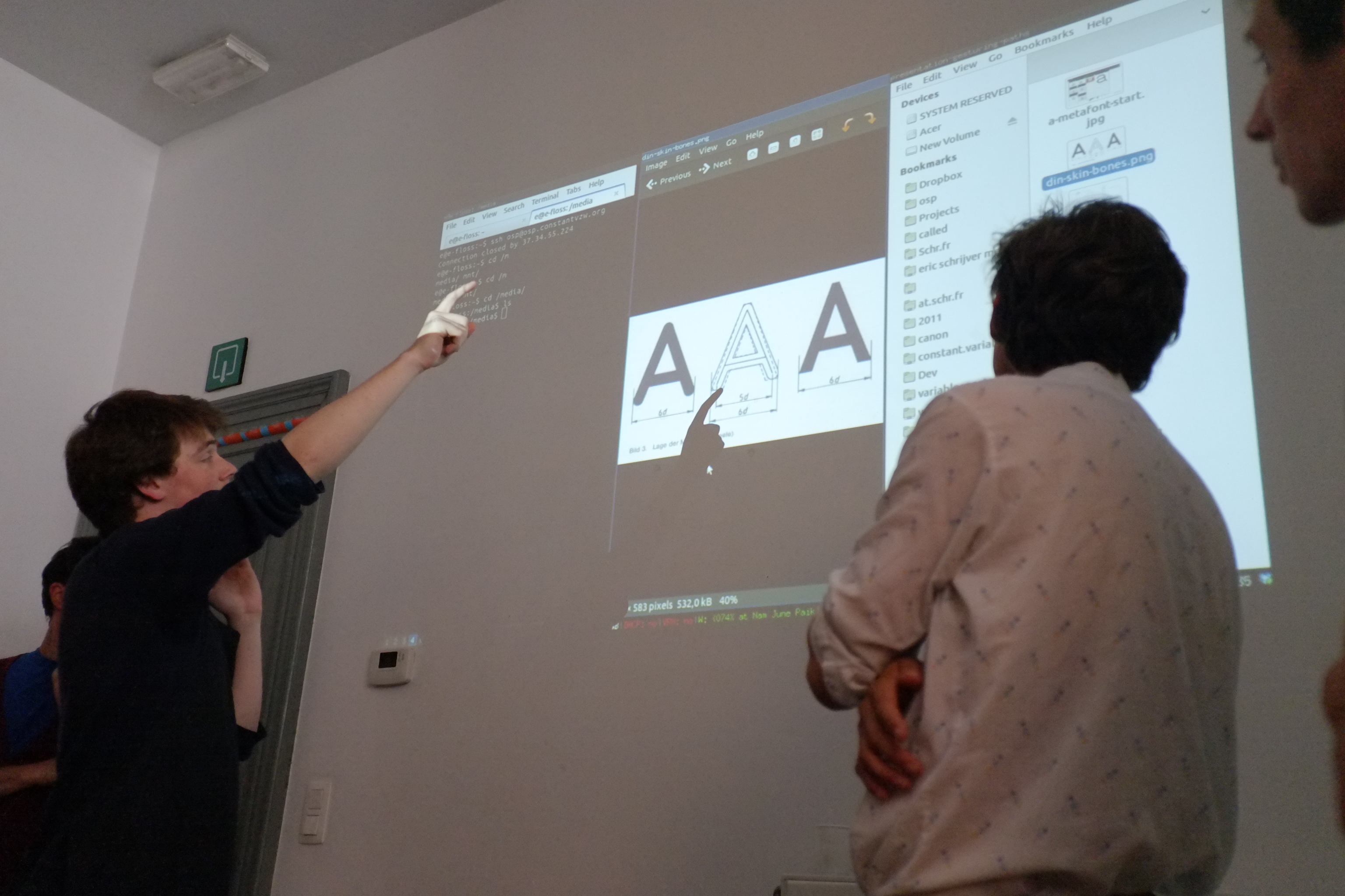
- After some research on the DIN schriften at the Institute itself in 2008, some versions are redrawn from 1932 plates as fonts with a modularity by blocks, grid based. The centerline version is still to investigate. http://ospublish.constantvzw.org/foundry/osp-din/
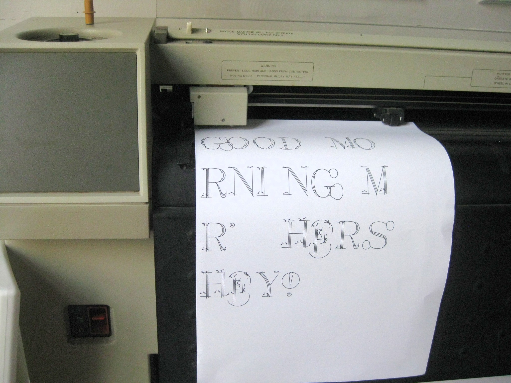
- Starting around 2010, some refurbished Roland plotter are used to draw strokes using various pens. Ideally, text could be drawn with single lines letters. But regular fonts produces typically double strokes. Scribus page layout software could print manipulated Truetype fonts with open contours, and a hack prevent the automatic closing operation. Another more broad approach use the public domain Hershey typefaces as python script to simulate pseudo-fonts functions. https://en.wikipedia.org/wiki/Hershey_font
- The Metafont format designed for TeX tend to describes characters by mathematical relationships. In 2013, OSP begins with Metadin to test out the modularity "by relationships" to design a revamped DIN family. http://osp.kitchen/foundry/metadin/
- Starting with 2013 Relearn summer school, various experiments are using autotracing by the centerline to generate stroke lettering. http://relearn.be/2013/r/worksessions::gesturing-paths::notes.html

- Alfphabet font is a redraw in the nineties by the stroke from the plates of the old Belgian road signage. With no constrast and strict geometry. Published by steps in 2012 and 2014. http://ospublish.constantvzw.org/foundry/alfphabet/

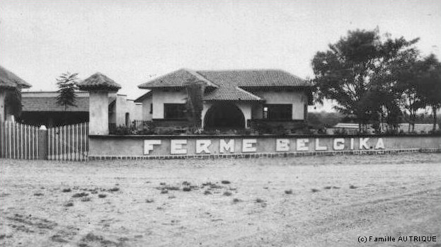
- Vernacular lettering by ingeneers with quite no contrast, like in the Belgika roof on a postcard from the beginning of the century in then-Elisabethville (Congo), share some characteristics with lettering by conceptual artists from the sixties. Enough to start discussions on how these shapes can fit with works of Vincent Meessen.
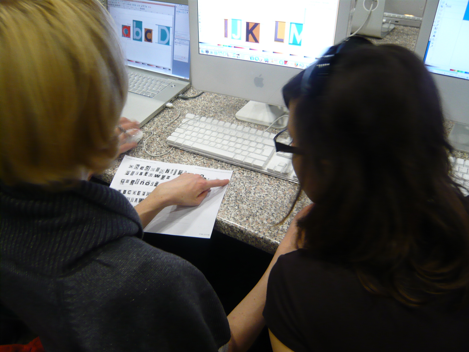
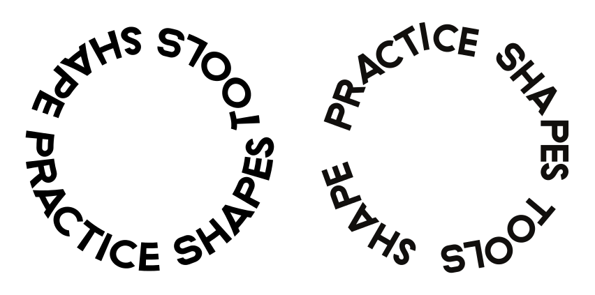
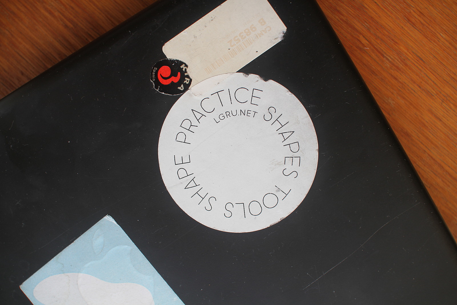
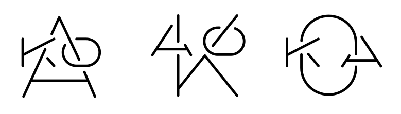
- In 2012, Pinpin font is based by Harrisson on the Free Sans, a libre version able to replace the pseudo-neutral Helvetica, by hacking some endings to infect a copyrighted Belgian comic lettering spirit. That kind of neutrality or its post-version is not enough generic to generate a spiral design for the "shape makes practice makes shape makes" LGRU sticker. A basic set of geometric strokes are combined to produce two versions of each capital letter needed. The not-named-at-that-time Belgica is modular by strokes.

Distortions in weight and at the tip of each stroke.
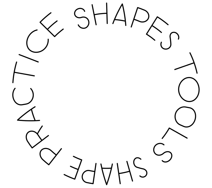
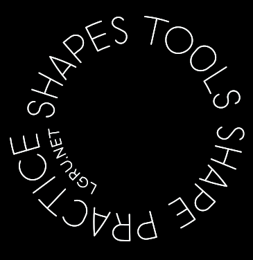
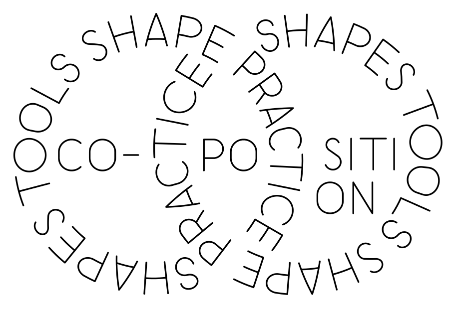
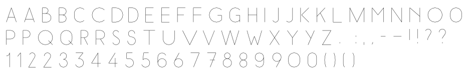
- Drawn using only straight lines and arcs, without any complex bezier curves, and elected as most flexible generic font, Belgica is use as drawings for texts for Meessen posters, book in preparation, and its centerline no-weight specificity is more precisely used to design punchers to write three double letters in the copper OORRSS plate.
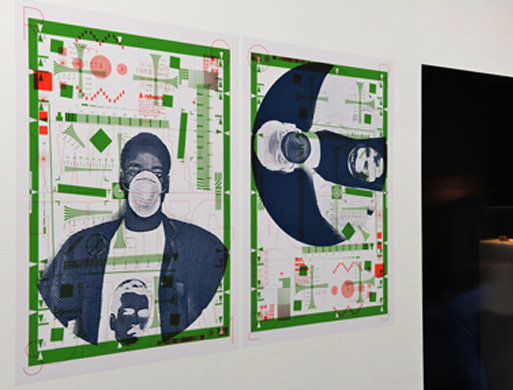
- Hershey Sans typeface is used to make a plotter write cartels for dozen of differents signature spelling produced in the begining of the twentiest century by Congolese artist Thela Tenduo, for its exhibition in duo with Vincent Meessen in Gent in 2014. http://www.kioskgallery.be/media/kiosk/ENG_Exhibition-text_kopie.pdf
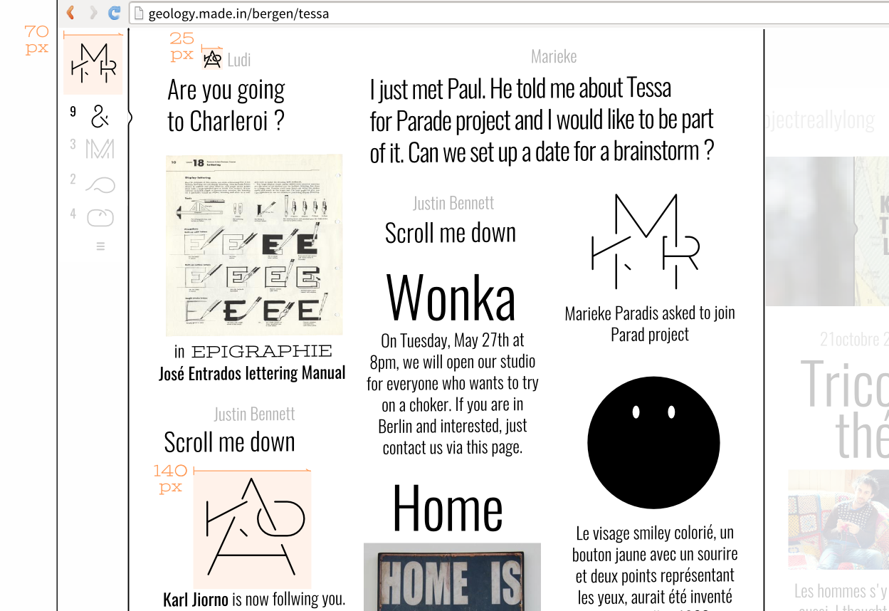
- In 2014, its relative simplicity is made at work with Ludi Loiseau and by Pierre Marchand for a program to generate monograms for the made.in social media project. An extended version is quickly derived. Another pseudo-font format is made of json shapes dynamically intertwined on web canvas.

- After the manual composition of Belgica shapes by graphic designer Delphine Platteuw for 'Personne et les autres' proposal by Vincent Meessen and Katerina Gregos for Venice Biennial 2015, the need for a font family to be used by Stefano Cernuschi at Mousse publisher with regular layout software become clear. Belgika, with its friezed contour Opentype fonts ghosts, is the first occurrence of it.
Content of the directory
- fontlog.txt: the font design-oriented changelog
http://openfontlibrary.org/wiki/Fontlog
http://scripts.sil.org/OFL-FAQ_web#00e3bd04 - construction
- shapes1.svg and shapes2.svg - the svg vectors files with the first and several steps to produce two LGRU logos and most of the letters
- belgica.svg - the svg vectors file with all the base letters at the right size to be copy/pasted in a 1000×1000 font unit in FontForge
- extended-version - the separate files, alphabet, extended version
- source
- belgika-Stroke.sfd - the base FontForge sfd file with stroked vectors
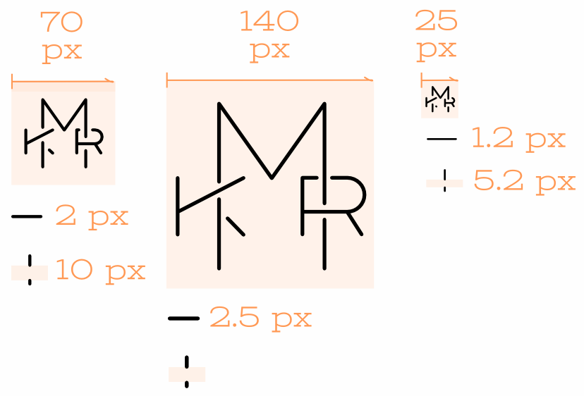
- belgika-5th.sfd, belgika-8th.sfd, belgika-16th.sfd, belgika-40th.sfd - the FontForge sfd with expanded and scaled contours at nth thickness ratio compared to 800 font unit, capital height of the font http://fontforge.sourceforge.net/sfdformat.html
- fonts
- belgika-5th.otf, belgika-8th.otf, belgika-16th.otf, belgika-40th.otf - otf fonts, able to be used in most software
- belgika-Stroke-PS-type-3 - Type 3 fonts, just for the pleasure to be still able to generate it, reverse-archaeology.
- documentation - some specimens
- ofl.txt: copyright notice header + license
- ofl-faq.txt: Frequently Asked Questions about the license and its collaboration model - http://scripts.sil.org/OFL
Production
- Drawn in Inkscape with two versions for nearly all letters.
- Exported in Fontforge with a selection of one of the two shapes.
- Stored as stroke font, some shapes optimised for better generation of contours (belgika-stroke.sfd)
- Each contour version is generated with a width fraction of the capital height of the font, and scaled to get the total height (with the thickness of the stroke) into the 800 font unit height, the metrics has been scaled accordingly.
- belgika-5th.sfd
- belgika-8th.sfd
- belgika-16th.sfd
- belgika-40th.sfd
Known issues and future developments
- The spacing needs kerning pairs.
- There is currently no Euro sign.
- Another future version can propose fonts without that scaling operation, to be able to superpose different weights.
- Of course, the switch between two or more shapes by glyph is a future must.
Coverage
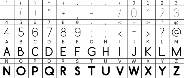
Belgika currently provides the following Unicode coverage:
- Basic Latin: U+0020-U+007E - 95 glyphs on 95
- Latin-1 Supplement: U+00a0-U+00FF - 95 glyphs on 96
- Latin Extended-A U+0100-U+017F - 0 glyphs on 128
Information for Contributors
Belgica-Belgika is released under the OFL 1.1 -- http://scripts.sil.org/OFL For information on what you're allowed to change or modify, consult the ofl.txt and ofl-faq.txt files. The ofl-faq also gives a very general rationale and various recommendations regarding why you would want to contribute to the project or make your own version of the font. See the project website for the current trunk and the various branches: http://ospublish.constantvzw.org/foundry/belgica-belgika
ChangeLog
(This should list both major and minor changes, most recent first.)
- 2 January 2015 - Version 1.0
- Initial release of shapes "Belgica" and fonts "Belgika" (4 weights) by Pierre Huyghebaert
Acknowledgements
If you make modifications be sure to add your name (N), email (E), web-address (W) and description (D). This list is sorted by last name in alphabetical order.
N: Pierre Huyghebaert
E: pierre@speculoos.com
W: http://www.speculoos.com
D: Typography Financial support by Speculoos.com and LGRU.net
Contexte historique
Avant l'apparition de la typographie vers 1450 en Occident, l'expérience de l'écriture était en contraste une pratique extrêmement variée (entre la caroline rapide des scribes et la capitale gravée dans le marbre des romains) et unifiée autour du trait et de son ductus. Le poinçon qui a commencé à dessiner des caractères par leur bord (leur extérieur) dans des matières dures destinées à produire en série des lettres en plomb a introduit une manière indirecte de comprendre la lettre. Et ainsi, depuis plus de cinq siècles, la typographie a été industriellement tenue séparée de l'écriture. Depuis la genèse de la typographie digitale, cette séparation a organiquement été maintenue, en partie par la révérence de la loge des typographes se sentant dépositaires d'une très longue tradition, en partie par souci de commodité par les grands éditeurs logiciels par ailleurs aux prises avec l'effroyable chantier de la gestion encore non entièrement résolue des très nombreux systèmes d'écritures existant dans le monde.
Quelques initiatives séparées ont émaillé ce large mouvement majoritaire. Quatre cas particuliers semblent intéressants à décrire.
Un des premiers mouvements de reconstruction de l'Allemagne industrielle après la première guerre mondiale est de mettre en place un institut de normalisation, le Deutsches Institut für Normung (DIN). Et lorsqu'il s'agit, au milieu des années vingt de décrire un système d'écriture standardisé, c'est par le trait et sur une grille que les ingénieurs allemands tentent de rassembler d'une manière cohérente l'ethos de chaque lettre. Pour ces outilleurs, l'épaisseur du tracé est défini par l'outil qui trace, le trait par son centre, la typographie des bords produite est donc un artefact local, perpétuant ainsi trois millénaires d'écriture humaine. Ce standard se plie donc à toutes sortes de variations en fonction des besoins, plus ou moins décrites dans les planches du standard, et reste largement à déduire au cas par cas par le bon sens de ses utilisateurs.
Dans les années soixante, lorsqu'il semble que les machines à commande numériques commencent à être introduites au US Naval Weapons Laboratory, le DR. Hershey met en place une série d'instructions permettant la gravure de lettres simple pour le marquage industriel et les premiers affichages digitaux à base de vecteurs. Loin du contexte typographique, ce jeu d'instruction circule librement sans licence trop restrictive, et est progressivement implémentée dans nombre d'applications industrielles civiles. Un nombre incalculable de plaques nominatives d'ascenseur sont ainsi gravée avec des lettres dessinées par l'armée américaine.
À la fin des années septante, le mathématicien Donald Knuth est mécontent du traitement typographique réservé à l'édition de ses équations et décide de mettre en place un système de composition entier, TeX, pour publier ses ouvrages "The Art of Computer Programming" encore en écriture à l'heure actuelle. Confiant de pouvoir construire numériquement l'antédiluvien lien entre typographie et mathématiques, Knuth décrit de manière algorithmique le format Metafont destiné à être utilisé dans TeX. Et c'est principalement par le ductus central que Metafont trace ses lettres et signes. N'utilisant que du code sans support visuel direct, le format est craint ou boudé pendant longtemps par les typographes. Le monde scientifique et lui seul utilise depuis le système TeX avec majoritairement les seules fontes proposées par son créateur, et cela sans souci particulier...
À la fin des années quatre-vingt, Adobe, après avoir mis en place le standard typographique appelé Type 1 et encore à la base des standards actuels, s'aventure à introduire le Type 3. Ce format permet de stocker dans chaque glyphe (espace visuel décrivant une lettre dans une fonte) n'importe quel type d'objet. Y compris donc des traits simples ouverts ou non plutôt qu'un contour strictement fermé. Ce qui permet à certains typographes d'introduire des polices construites selon un principe de dessin vectoriel se rapprochant de l'écriture. Mais l'ouverture du format, autorisant l'inclusion de tout type d'objet, a tendance à saturer la mémoire encore très restreinte des unités de traitement des imprimantes de l'époque. Et une réputation d'insécurité fait rapidement retirer les Type 3 de la circulation par Adobe, qui ne veut prendre aucun risque de fiabilité des solutions proposées par elle au moment même où Apple et Microsoft l'attaquent avec le format Truetype concurrent du Type 1.
Hacking - En mélangeant sans hiérarchie précise ces quatre expériences, le collectif OSP (Open Source Publishing) suit un sentier de traverse pour ramener cette question des 'stroke fonts' régulièrement au milieu de la table. Ainsi un alphabet double est tracé par éléments modulaires dans un logiciel de dessin, à distance des pratiques typographiques. Les lettres y prennent chacune deux formes différentes pour appuyer leur rapport avec l'écriture où l'aspect de chaque lettre peut est adapté en fonction de l'influence visuelle de ses voisines. Un visuel en spirale et récursif expérimente avec un autre type de déformation que ces formes produisent. Ailleurs, un hack modifie la fermeture automatique des fontes considérées par le logiciel de mise en page Scribus comme une erreur mais volontairement introduites pour produire des fontes au trait. Plus loin, le trait est utilisé à l'essence de sa non-épaisseur pour produire la lame sinueuse des poinçons qui frappent les lettres ORS sur des plaques de laiton. Ou encore ces projets de couverture d'ouvrages à paraître où le trait est démultiplié par l'épaisseur sur des lettres superposées. Le trait encore est interrompu par un algorithme pour permettre la création automatique de monogrammes pour un média social en préparation. Le trait toujours, lors de son apparition, gelé temporairement par efficacité pour une fonte à utiliser selon les standards par un tiers en Italie.
Retour au Belgika - Le propriétaire le demande, il faut un grand Belgika sur le toit de cette baraque, pour marquer le lieu. L'ingénieur trace les sept lettres sur une feuille et les dimensionne. Quelqu'un, ou peut-être étaient-ils deux, peint avec un certain soin chaque lettre. Un empattement est ajouté au G pour lui donner une sorte d'équilibre. La graisse de la barre centrale du B hésite et l'interlettrage est un peu trop mécanique mais le résultat ne manque pas d'élégance. Quand une carte postale immortalise l'alignement des vélos sous cet auvent d'Elisabethville quelques temps après, le contraste des lettres, même en angle, est bien marqué.
Comment plier ces sommes d'expériences pour les amener vers des formes à superposer.