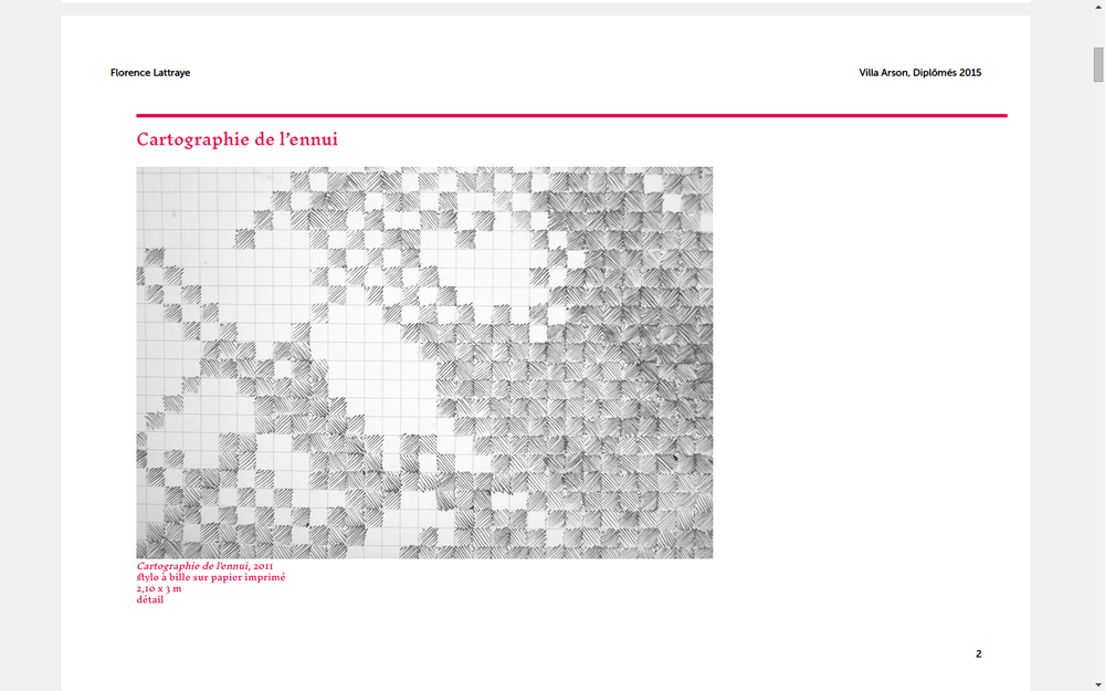
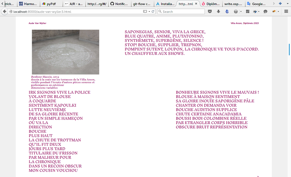
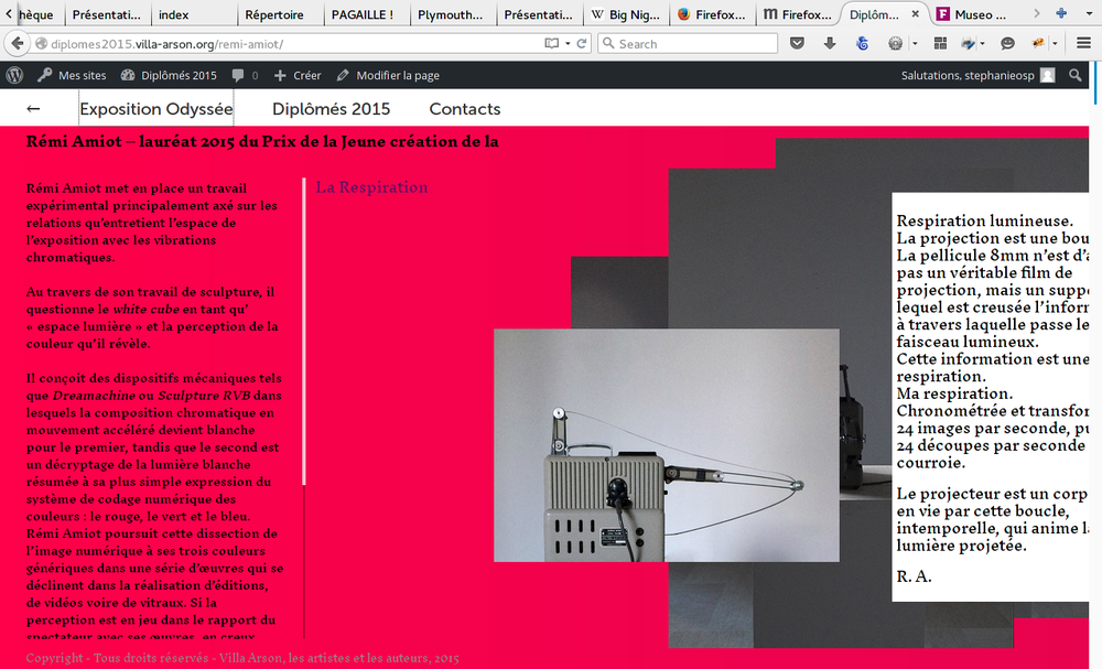
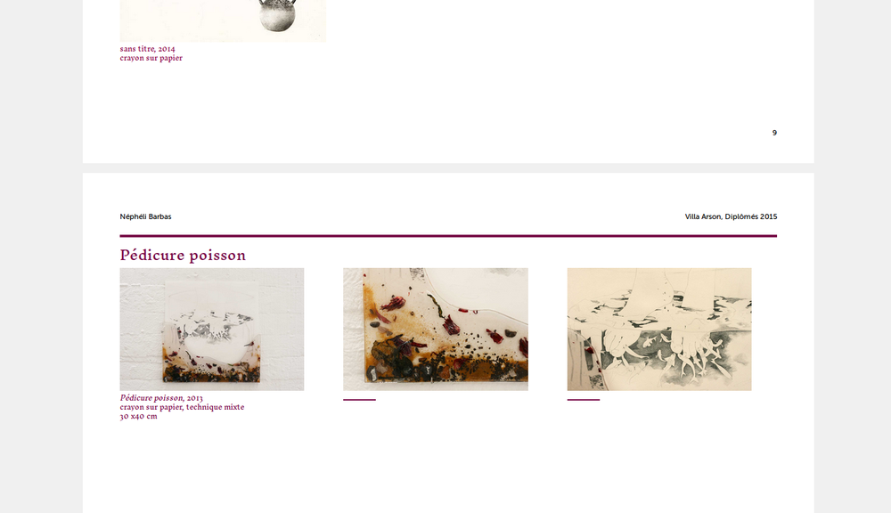
Download raw (6.6 KB)
@font-face {
    font-family: "Inknut Antiqua";
    src: url("assets/fonts/InknutAntiqua-Regular.ttf");
}
@font-face {
    font-family: "Museo Sans";
    src: url("assets/fonts/MuseoSans_500.otf");
    font-style: normal;
}
@font-face {
    font-family: "Museo Sans";
    src: url("assets/fonts/MuseoSans_500_Italic.otf");
    font-style: italic;
}

/* -------------------------------------------- VARIABLES ----------------------------------------- */
@font-size: 15px;
@line-height: 19.5px;
@pink: #FF004A;
@blue: #191970;

/* -------------------------------------------- FLOW ----------------------------------------- */

.recipient {
    //-webkit-flow-from: myStory;
            flow-from: myStory;
}

#main {
    //-webkit-flow-into: myStory;
            flow-into: myStory;
}


/* -------------------------------------------- GENERIC CLASSES ----------------------------------------- */
html,
body {
    width: @page-width - (@page-margin-inside + @page-margin-outside);
}
body{
	font-family: 'Inknut Antiqua', serif;
	font-size: @font-size;
	line-height: @line-height;
}
#main {
    width: @page-width - (@page-margin-inside + @page-margin-outside);
}

h1,
h2 {
    color: inherit;
    //margin-top: @line-height * 3;
    //-webkit-region-break-before: always;
}

p {
    margin: 0px;
}
p + p {
    text-indent: @line-height * 2;
}

a {
    text-decoration: none;
    color: inherit;
}

em {
    font-style: italic;
}

div.column {
    float: left;
    padding: 0 @line-height / 2;
    height: 100%;
    box-sizing: border-box;
}

div.column90 { width: 90%; }
div.column60 { width: 60%; }
div.column50 { width: 50%; }
div.column33 { width: 33%; }
div.column25 { width: 25%; }


/* -------------------------------------------- HEADER ----------------------------------------- */
.header {
    font-size: @font-size / 1.3;
    text-align: left !important;
    font-family: "Museo Sans";
    font-style: normal !important;

    &:after {
        position: absolute;
        right: 0;
        font-size: @font-size / 1.3;
        font-style: normal !important;
    }

    .mentiondiplomes {
        display: none;
    }
	.notes{
        font-size: @font-size / 1.3 !important;
        font-family: 'Inknut Antiqua', serif;
        text-indent: 0px;
	}
	p {
        margin-bottom:0px;
	}

}

#page-1 .header {
    font-size: @font-size / 1.3;

    .mentiondiplomes {
        display: inline;
        font-size: @font-size / 1.3;
        font-style: italic !important;
    }
}

.footer {
    text-align: right;
    font-size: @font-size / 1.3;
    font-family: "Museo Sans";
}

//.paper:last-of-type .footer:before {
//    content: "Design graphique par OSP — Édité depuis le site des Diplômés 2015 – Villa Arson Nice";
//    position: absolute;
//    left: 10mm;
//}
//
#colophon {
    position: absolute;
    bottom: 10mm;
    left: 15mm;
    font-size: @font-size / 1.3;
    font-family: "Museo Sans";
}

/* -------------------------------------------- INTRODUCTION ----------------------------------------- */
#intro {
    font-size: @font-size * 1.4;
    line-height: 28px !important;
    -webkit-region-break-after: always;
    break-after: always;
    color: @pink;

    p {
        text-indent: @line-height * 4;
        max-width: none;
		margin-bottom:0px!important;
        break-inside: avoid;
    }
    p:last-child,
    #signature {
        font-size: @font-size  !important;
    }
}
h1,
.mentiondiplomes {
    display: none;
}


/* -------------------------------------------- MAIN CONTENT ----------------------------------------- */
.container {
    margin-left: @line-height * 2;
}


.fusion-post-large {
    -webkit-region-break-after: always;
    break-after: always;
    clear: both;
    margin-bottom: @line-height * 2;
    font-size: @font-size;
    line-height: @line-height;
    //min-height: @page-height - (@header-height + @footer-height);

    p {
       //text-indent: 0 !important;
       //float: left;
    }
}
h2 {
    clear: both;
    //margin-top: px;
    margin-bottom: @line-height / 2.5;
    border-top: 4px solid ;
    font-size: @font-size * 1.35;
    line-height: @line-height * 1.5;
	padding-top:10px;

}
.fusion-post-content-container {
    display: flex;
    flex-direction: row;
    flex-wrap: wrap;
    align-content: flex-end;
    justify-content: space-between;
    display: -webkit-flex;
    -webkit-flex-direction: row;
    -webkit-flex-wrap: wrap;
    -webkit-align-content: flex-end;
    -webkit-justify-content: space-between;
    //.flexbox();
    //.flex-wrap(wrap);
    //.flex-direction(row);
    //.align-content(bottom);
    //.justify-content(space-between);
}

.picture {
    -webkit-region-break-inside: avoid;
    break-inside: avoid;
    //height: 7cm;
    width: 30%;
    margin-right: @line-height;
    margin-bottom: @line-height / 1.5 ;
    //flex-basis: 30%;
    //flex-grow: 1;
}
img {
    object-fit: contain;
    object-position: bottom left;
    max-height: 5cm;
    //max-width: none !important;
}
figcaption {
    font-size: @font-size / 1.5;
    line-height: @line-height / 1.4;
}
figcaption.idem {
    width: 5em;
    height: 1em;
    border-bottom: 2px solid;
}

.picture:only-child {
    width: 100%;

    img {
        max-height: 12cm;
    }
}

.text {
    width: 60%;
	//float:left;
    //clear: both;
	padding-right:7px;
    //flex-grow: 2;
    //flex-basis: 60%;
}

.notes{
	margin-top:7px;
	margin-bottom:10px;
    font-size: @font-size / 1.5;
    line-height: @line-height /2;

}

.sectiondetexte {
    width: 50%;
}

.text .sectiondetexte {
    //max-width: none;
    width: 100%;
}
h1.entry-title {
    margin-top: 0;
}

p.mentiondiplomes {
    //font-style: italic;
    text-indent: 0;
    //margin-bottom: @line-height;
}


.fusion-video iframe,
.fusion-soundcloud iframe{
	display:none;
}

.fusion-video,
.fusion-soundcloud {
    color: inherit;
    font-family: "Museo Sans";
    border:solid 8px /*gray*/ ;
    background-color:#F5F5F5;;
    padding:12px 14px 16px 14px;
    font-size: @font-size / 1.3;
    max-width: 50%;
    word-break: break-word;
	line-height: @line-height / 1.2;
    margin-top: @line-height;
    margin-bottom: @line-height;
    margin-right: @line-height;

	p {
		  text-indent: 0px !important;
	}
}

#contacts {
    font-size: @font-size;
    display: flex;
    flex-wrap: wrap;
    flex-direction: row;
    justify-content: space-around;
    color: @blue;
    break-inside: avoid;

    h2 {
        flex-basis: 100%;
    }
}

#wpadminbar,
.fusion-footer {
    display: none;
}


body.chemin-de-fer {
    width: @paper-width * 4;
    #pages {
        width: @paper-width * 4;
        transform-origin: 0 0;
        transform: scale(0.33);
    }
    .paper {
        float: left;
        margin: 1em;
    }
}