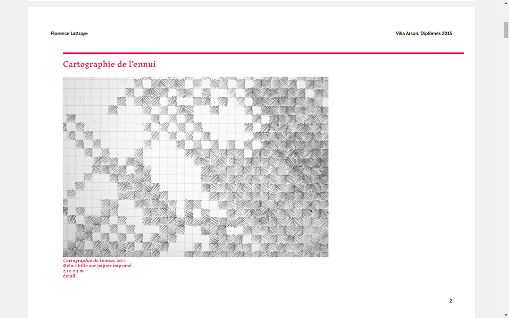
Download raw (3.5 KB)
/**
 * Computation
 */


/* EXTRA SPACE AROUND THE PAGE: BLEED + CROP */
// TODO: find a more appropriate name
@crop: @crop-size + @bleed;

/* GEOMETRY OF THE PAPER SHEET */
@paper-width: @page-width + ( @crop * 2 );
@paper-height: @page-height + ( @crop * 2 );

/* SIZE OF SPREAD */
@spread: @page-width * 2;


/**
 * DEFINITION OF THE PAPER SHEET
 */
@page {
    size: @paper-width (@paper-height + 5);
    margin: 0;
}


/**
 * CANVAS
 */

@media all {
    body {
        margin: 0;
    }
    .paper {
        width: @paper-width;
        height: @paper-height;
        box-sizing: border-box;

        /* Crop marks */
        padding: @crop;

        counter-increment: page-counter;

        /* utile ou non? pour éviter qu'un papier soit coupé par le format de la
        * page lors de la conversion et l'arrondis des unités */
        page-break-inside: avoid;
        //page-break-after: always;
        overflow: hidden;

        /* Crop marks */
        background-image:
            -webkit-linear-gradient(90deg, black 0, black 100%),
            -webkit-linear-gradient(0deg, black 0, black 100%),
            -webkit-linear-gradient(90deg, black 0, black 100%),
            -webkit-linear-gradient(0deg, black 0, black 100%),
            -webkit-linear-gradient(90deg, black 0, black 100%),
            -webkit-linear-gradient(0deg, black 0, black 100%),
            -webkit-linear-gradient(90deg, black 0, black 100%),
            -webkit-linear-gradient(0deg, black 0, black 100%)
        ;
        background-size:
            @crop-size 1px,
            1px @crop-size,
            @crop-size 1px,
            1px @crop-size,
            @crop-size 1px,
            1px @crop-size,
            @crop-size 1px,
            1px @crop-size
        ;
        background-position:
            left @crop,
            @crop top,
            right @crop,
            (@paper-width - @crop) top,
            right (@paper-height - @crop),
            (@paper-width - @crop) bottom,
            left (@paper-height - @crop),
            @crop bottom
        ;
        background-repeat: no-repeat;
    }
    .h2p-page {
        width: @page-width;
        height: @page-height;
        box-sizing: border-box;
        position: absolute; // in webkit, the page is really small in height otherwise
        text-rendering: optimizeLegibility;
    }

}

@media screen {
    body {
        background-color: #F0F0F0 !important;
    }

    #pages {
        width: @paper-width;
        height: @paper-height;

        margin-left: auto;
        margin-right: auto;
    }
    .spread #pages {
        width: @paper-width * 2;
        height: @paper-height * 2;
    }
    .paper {
        /* centrer la page à l'écran */
        background-color: white;
        margin-top: 1em;
        margin-bottom: 1em;
    }
}


@media print {
    html {
        width: @paper-width;
    }
    body {
        /* Allows printing of background colors */
        background-color: white;
        -webkit-print-color-adjust: exact;
                print-color-adjust: exact;
    }
    #pages {
        // Forces this div to start at the top of the page (bug in Chromium)
        position: absolute;
        top: 0;
    }
}

/**
 * Helpers
 */

.region-break {
    /* Apply this class to an element to put it on a new region.
     * Hint:
     * You can also use an empty <div class="page-break"></div>
     * if you want to put manual page breaks without attaching it to an HTML element
     */
    -webkit-region-break-before: always;
}