Download raw (5.3 KB)
$form-border-color: #eee;
$form-active-color: #000;

.form-group.has-errors {
    background: rgba(255,0,0,0.05);
    border: 1px solid rgba(255,0,0,0.2);
    border-radius: 3px;
    margin: 0 -5px;
    padding: 0 5px;
}

.form-errors {
    color: #b52b27;
}

.form-honeybear {
    visibility: hidden;
    position: absolute !important;
    height: 1px;
    width: 1px;
    overflow: hidden;
    clip: rect(1px, 1px, 1px, 1px);
}

.form-errors p {
    margin: 0;
}

.form-input-file {

    input {
        display: none;
    }

    .dz-default.dz-message {
        position: absolute;
        text-align: center;
        left: 0;
        right: 0;
        top: 50%;
        transform: translateY(-50%);
        margin: 0;
    }

    &.dropzone {
        position: relative;
        min-height: 70px;
        border-radius: 3px;
        margin-bottom: .85rem;
        border: 2px dashed #ccc;
        color: #aaa;
        padding: 0.5rem;

        .dz-preview {
            margin: 0.5rem;

            &:hover {
                z-index: 2;
            }

            .dz-error-message {
                min-width: 140px;
                width: auto;
            }

            .dz-image,
            &.dz-file-preview .dz-image {
                border-radius: 3px;
                z-index: 1;
            }
        }
    }
}


// New JS powered tabs
.form-tabs {

    .tabs-nav {
        display: flex;
        padding-top: 1px;

        margin-bottom: -1px;

        a {
            flex: 1;
            transition: color 0.5s ease, background 0.5s ease;
            cursor: pointer;
            text-align:center;
            padding: 10px;
            display: flex;
            align-items: center;
            justify-content: center;
            border-bottom: 1px solid $form-border-color;
            border-radius: 5px 5px 0 0;

            &.active {
                border: 1px solid $form-border-color;
                border-bottom: 1px solid transparent;
                margin: 0 -1px;

                span {
                    color: $form-active-color;
                }
            }
        }

        span {
            display: inline-block;
            line-height: 1.1;
        }

    }

    &.subtle .tabs-nav {
        margin-right: 0 !important;
    }

    .tabs-content {

        .tab__content {
            display: none;
            padding-top: 2rem;

            &.active {
                display: block;
            }
        }
    }
}

// Checkboxes
.checkboxes {
    display: inline-block;

    label {
        display: inline;
        cursor: pointer;
        position: relative;
        padding: 0 0 0 20px;
        margin-right: 15px;

    }
    label:before {
        content:"";
        display: inline-block;
        width: 20px;
        height: 20px;
        left: 0;
        margin-top: 0;
        margin-right: 10px;
        position: absolute;
        border-radius: 3px;

        border: 1px solid #e6e6e6;

    }
    input[type=checkbox] {
        display: none;
    }
    input[type=checkbox]:checked + label:before {
        content:"\2713";
        font-size: 20px;
        line-height: 1;
        text-align: center;
    }

    &.toggleable label{
        margin-right: 0;
    }
}

// Toggleable
.form-field-toggleable {
    .checkboxes.toggleable {
        margin-right: 5px;
        vertical-align: middle;
    }
    .checkboxes + label {
        display: inline-block;
    }
}

// Toggles
.switch-toggle {
    display: inline-flex;
    overflow: hidden;
    border-radius: 3px;
    line-height: 35px;
    border: 1px solid $form-border-color;

    input[type=radio] {
        position: absolute;
        visibility: hidden;
        display: none;
    }

    label {
        display: inline-block;
        cursor: pointer;
        padding: 0 15px;
        margin: 0;
        white-space: nowrap;
        color: inherit;
        transition: background-color 0.5s ease;
    }

    input.highlight:checked + label {
        background: #333;
        color: #fff;
    }

    input:checked + label {
        color: #fff;
        background: #999;
    }


}

/* Signature Pad */
.signature-pad {
    position: relative;
    display: -webkit-box;
    display: -ms-flexbox;
    display: flex;
    -webkit-box-orient: vertical;
    -webkit-box-direction: normal;
    -ms-flex-direction: column;
    flex-direction: column;
    font-size: 10px;
    width: 100%;
    height: 100%;
    max-width: 700px;
    max-height: 460px;
    border: 1px solid #f0f0f0;
    background-color: #fff;
    padding: 16px;
}

.signature-pad--body {
    position: relative;
    -webkit-box-flex: 1;
    -ms-flex: 1;
    flex: 1;
    border: 1px solid #f6f6f6;
    min-height: 100px;
}

.signature-pad--body canvas {
    position: absolute;
    left: 0;
    top: 0;
    width: 100%;
    height: 100%;
    border-radius: 4px;
    box-shadow: 0 0 5px rgba(0, 0, 0, 0.02) inset;
}

.signature-pad--footer {
    color: #C3C3C3;
    text-align: center;
    font-size: 1.2em;
}

.signature-pad--actions {
    display: -webkit-box;
    display: -ms-flexbox;
    display: flex;
    -webkit-box-pack: justify;
    -ms-flex-pack: justify;
    justify-content: space-between;
    margin-top: 8px;
}

[data-grav-field="array"] .form-row {
    display: flex;
    align-items: center;
    margin-bottom: 0.5rem;
}

[data-grav-field="array"] .form-row > input,
[data-grav-field="array"] .form-row > textarea
{
    margin: 0 0.5rem;
    display: inline-block;
}
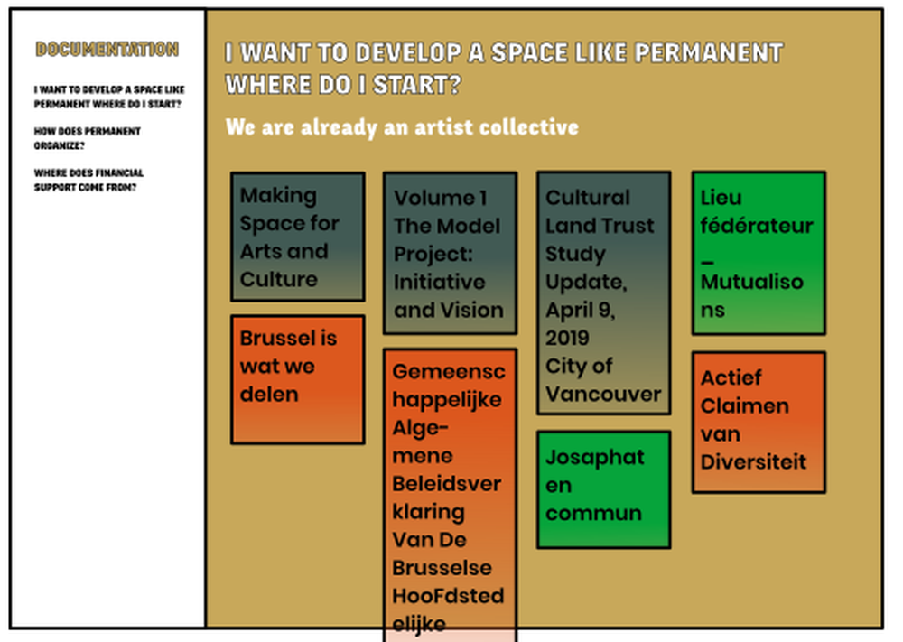