Download raw (7.6 KB)
Title: interpunctie samples all.pdf
Date: 2011-10-26 21:47
Author: Pierre
Tags: Fonts, News, Design Samples, How-to, Libre Fonts, Printing + Publishing, Tools, Type
Slug: interpunctie-samples-all-pdf
Status: published
From Thursday 20th to Sunday 23rd November OSP went to contemplate the
Bolwerk archives landscape from the window of [Frans Masereel
Centrum](http://www.fransmasereelcentrum.be/). As part of
[Bolwerk](http://www.ooooo.be/interpunctie)'s residency, we were invited
to propose a reading of Bolwerk's material inbetween its punctuation.
Linked to our actual and future projects, this journey also presented
itself as a good start to investigate archive visualization/schematics
and digest. We arrived with a proposal focussing on tools development,
bases of an archives blender, a small chain of automatic process.
On the spot, in the plastic yurt heated by a wood-burning stove, we
discovered 87000+ files on the Bolwerk nas harddrive. All our sources
(scripts, tests, drawings and pictures) are gathered in [this public git
repository](http://git.constantvzw.org/?p=osp.residency.masereel.git).
In the current documentation text, you can find
[links](http://git.constantvzw.org/?p=osp.residency.masereel.git;a=tree)
to readable files and preview of the result.
To have an overview of all the digital archives, we first built [4 bash
scripts](http://git.constantvzw.org/?p=osp.residency.masereel.git;a=blob;f=landscape-plotter.sh)
going through the directories looking on 4 criterias:
- time scale
- number of files
- size of the files
- filetypes
From this, we get a text output already drawing a first visual
landscape, see
[landscape-saturday.csv](http://git.constantvzw.org/?p=osp.residency.masereel.git;a=blob;f=landscape-saturday.csv)
Then, in a graphic translation attempt, we started a plotter script, to
plot this landscape into visual/graphic shapes. Is it the rotary
structure of the physical archive in the yurt, or our temporary traveler
status here that resonate with Bolwerk's seems permanent one? It's not
clear but we had this idea to draw the directories as bags, attributing
one parameter to their description elements.
- width : time scale
- height : number of files
- colors of the bag : filetypes
- roundness : size of the files
See
[plot4.svg](http://git.constantvzw.org/?p=osp.residency.masereel.git;a=blob;f=plotter/plot4.svg)
(in /plotter directory).
[{: .alignleft .size-full .wp-image-6857 }]({filename}/images/uploads/plot4.png)
The shapes are distributed along the timeline from left to right
(1997-2011). The most large they are the more the files and directories
they contain, the vertical piling was defined by the browsing order. The
archives has been clearly compiled with 2 past periods of grouping, and
a more regular the lasts years (as many archiving of digital files
travel from one kind of media to another).
[{: .alignleft .size-full .wp-image-6857 }]({filename}/images/uploads/bag.png)
This attempt to draw the landscape with differents bags, raised again
questions that were floating around us for a while. How to shape the
bags/directories, can we avoid the designer/developer dichotomy
(starting from an arbitrary symbol/drawing / from an arbitrary process)?
Plot only the dots contained in the files in the directories, as a free
interpretation of the screening process present in different place in
this graphic farm and in answer for the astonishingly new question from
Marthe for us "how the shape of the dot vary with fonts"? Or the files
as dots? Why are we somehow reluctant to visualize the data of the
archives? After years of [Edward
Tufte](http://www.edwardtufte.com/tufte/) impact on some of us and on
the field, is it linked to Ted Byfield's [conference in Tel
Aviv](http://www.shenkar.ac.il/digitalcultureconf/speakers.html) where
he develop some aspects of [its
critics](http://streamingculture.parsons.edu/parsons-the-new-school-for-design-050710-0516pm/),
or the approximation found at [middle
page](http://www.yuxiyou.net/blog/) and elsewhere, or around [that
article](http://www.guardian.co.uk/news/datablog/2011/oct/17/data-visualisation-visualization?CMP=twt_gu)
or [these
pamphlets](http://www.smashingmagazine.com/2011/10/21/the-do%e2%80%99s-and-don%e2%80%99ts-of-infographic-design-revisited/)
about visualization? Is the muted but even more palpable and strong
influence, here at the wood cutting Masereel mansion, of the
[Isotype](http://en.wikipedia.org/wiki/Isotype_%28picture_language%29)
system from the team Neurath/woodcutter Arntz and particulary the
transformation of complex source information into a sketch for a
self-explanatory chart, mainly by the transformer Marie Reidemeister?
Looking to it as a landscape in a contemplative way, looking at the
hard-drive in a calm way, different for an top/down approach of some
past anthropological pseudo-objectivity or burning with some efficiency
in mind, by practicing it like to roving some paths in the forest?
Because we feel that practicing the data, chewing it up, became part of
it as in any quantum experience was the only way to try to balance a bit
the asymmetric and problematic relationship that we can have with a 14
years archive of a multi-crossed-mono-person-organisation (and that we
dare to link with Roy Wagner, à propos des relations initiales avec les
Daribi de la Nouvelle-Guinée, "leur façon de ne pas me comprendre
n'était pas la même que celle que j'avais de ne pas les comprendre"
maybe also because our permanent cross-lingual during that residency,
which shape also deeply the *incorrect* writing of the current post).
Our favorite atomic bricks, fonts and her quarks glyphs, and more
precisely fonts contained in the pdfs contained in the archive, appears
to be possible candidates to bootstrap us from the wood smoke. An
excavator is added, the fonts resulting of that operation shows how
different applications embed and subset fonts when exporting pdfs. By
counting the fonts, merging the fonts that are each directory, based on
glyph missing, producing the digital upper-and-lower-cases of Bolwerk.
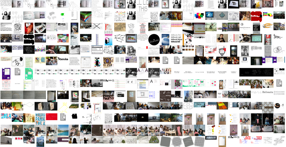
As a last detour we plotted the samples collection through Scribus
outlined pdf, [see
plotter/samples](http://git.constantvzw.org/?p=osp.residency.masereel.git;a=tree;f=plotter/samples;h=8f9f546a5f29d836eded41d701f110b5fb3af370;hb=HEAD),
like an echo to decrypt from a certain today in the fiction of being
already in the future.
[{: .alignleft .size-full .wp-image-6857 }]({filename}/images/uploads/samples_all_outlined_124.png)
-
[samples\_all\_outlined.pdf](http://git.constantvzw.org/?p=osp.residency.masereel.git;a=blob;f=plotter/samples/samples_all_outlined.pdf)
(all the chars of the merged fonts - 458 pages)
-
[interpunctie\_samples.pdf](http://git.constantvzw.org/?p=osp.residency.masereel.git;a=blob;f=plotter/samples/interpunctie_samples.pdf)
(all the periods of the merged fonts on one sheet)
-
[interpunctie\_samples\_all.pdf](http://git.constantvzw.org/?p=osp.residency.masereel.git;a=blob;f=plotter/samples/interpunctie_samples_all.pdf)
(more interpunction)
- and
[interpunctie\_all\_esthetified.pdf](http://git.constantvzw.org/?p=osp.residency.masereel.git;a=blob;f=plotter/samples/interpunctie_all_esthetified.pdf)
for which Gijs write us as a temporary end dot: "*I've put some thought
into that name. It felt like a bizarre act / twist:to just center the
text out of aesthetic considerations. After such a rough process.*"
[{: .alignleft .size-full .wp-image-6857 }]({filename}/images/uploads/interpunctie_samples_all1.png)