Download raw (5.3 KB)
<!DOCTYPE HTML PUBLIC "-//W3C//DTD HTML 4.01 Transitional//EN" "http://www.w3.org/TR/html4/loose.dtd">
<html lang="en">
<head>
<meta http-equiv="Content-Type" content="text/html; charset=UTF-8">
<meta name="viewport" content="width=device-width, initial-scale=1">
<meta http-equiv="X-UA-Compatible" content="IE=edge">
<style type="text/css">
/* Outlines the grids, remove when sending */
table td { }
body{
font-family: sans-serif;
text-align: left;
}
/* CLIENT-SPECIFIC STYLES */
body, table, td, a { -webkit-text-size-adjust: 100%; -ms-text-size-adjust: 100%; }
table, td { mso-table-lspace: 0pt; mso-table-rspace: 0pt; }
img { -ms-interpolation-mode: bicubic; }
/* RESET STYLES */
img { border: 0; outline: none; text-decoration: none; }
table { border-collapse: collapse !important; }
body { margin: 0 !important; padding: 0 !important; width: 100% !important; }
/* iOS BLUE LINKS */
a[x-apple-data-detectors] {
color: inherit !important;
text-decoration: none !important;
font-size: inherit !important;
font-family: inherit !important;
font-weight: inherit !important;
line-height: inherit !important;
}
/* ANDROID CENTER FIX */
div[style*="margin: 16px 0;"] { margin: 0 !important; }
/* MEDIA QUERIES */
@media all and (max-width:639px){
.wrapper{ width:320px!important; padding: 10px !important; }
.container{ width:300px!important; padding: 10px !important; }
.mobile{ width:300px!important; display:block!important; padding: 10px !important; }
.img{ width:100% !important; height:auto !important; }
*[class="mobileOff"] { width: 0px !important; display: none !important; }
*[class*="mobileOn"] { display: block !important; max-height:none !important; }
}
</style>
</head>
<body style="margin:0; padding:0; background-color:#F2F2F2;">
<span style="display: block; width: 640px !important; max-width: 640px; height: 1px" class="mobileOff"></span>
<br>
<br>
<center>
<table width="100%" border="0" cellpadding="0" cellspacing="0" bgcolor="#F2F2F2">
<tr>
<td align="center" valign="top">
<table width="640" cellpadding="0" cellspacing="0" border="0" class="wrapper" bgcolor="#FFFFFF">
<tr>
<td height="10" style="font-size:10px; line-height:10px;"> </td>
</tr>
<tr>
<td align="center" valign="top">
<table width="600" cellpadding="0" cellspacing="0" border="0" class="container">
<tr>
<td align="left" valign="top">
<br>
<h2>Up Pen Down</h2>
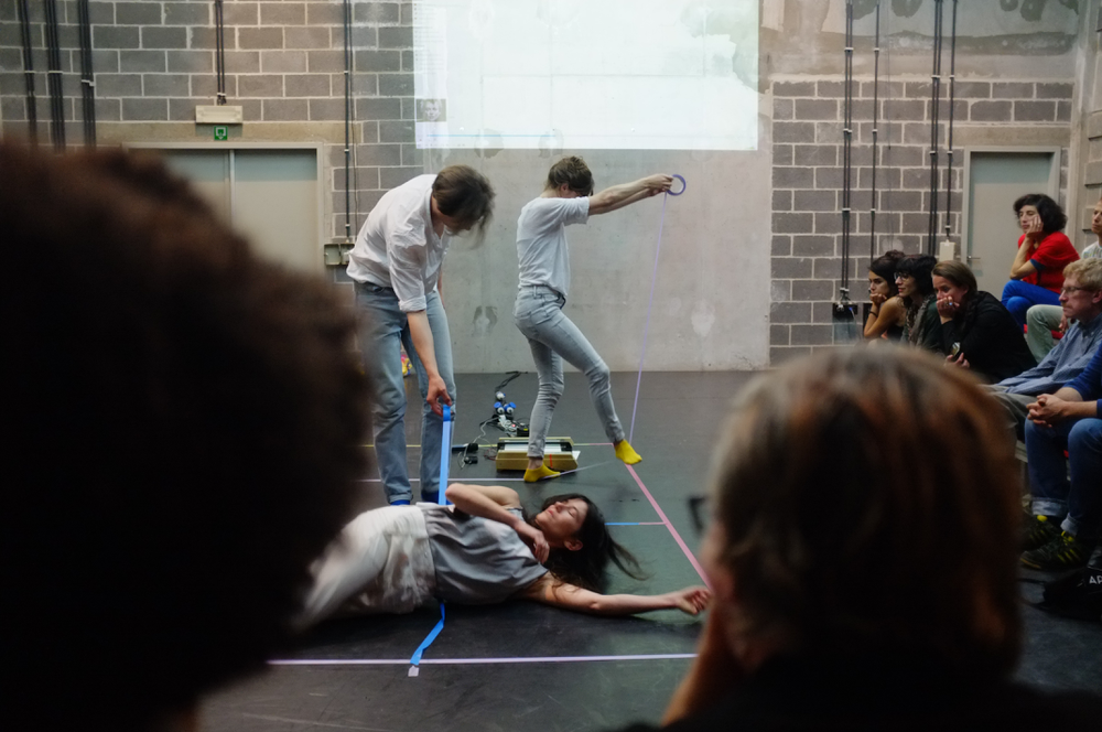
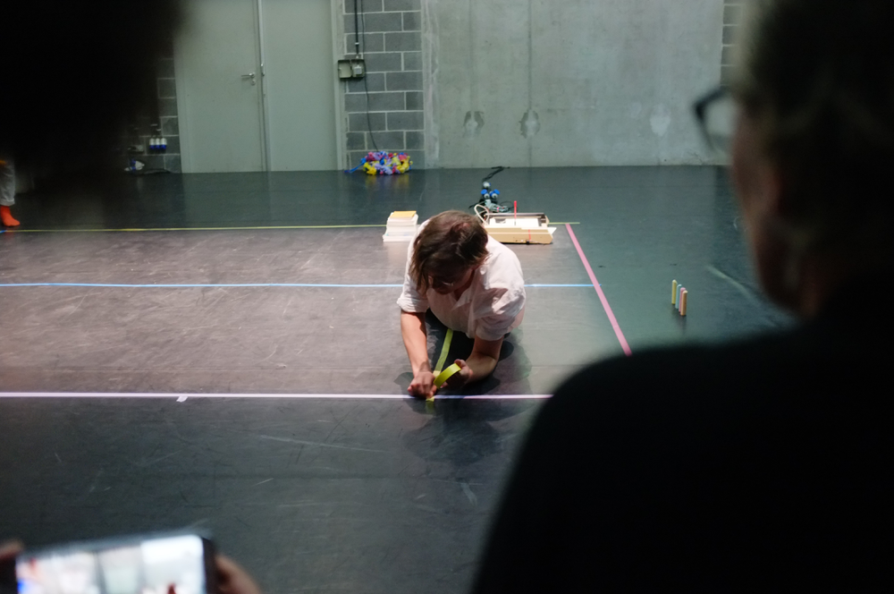
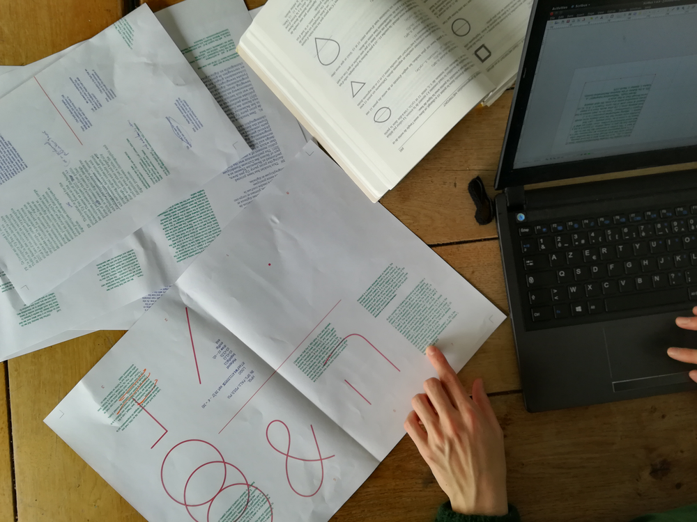
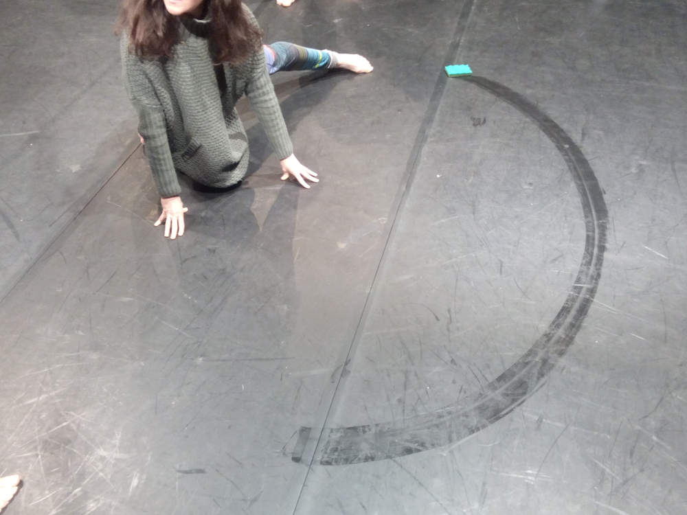
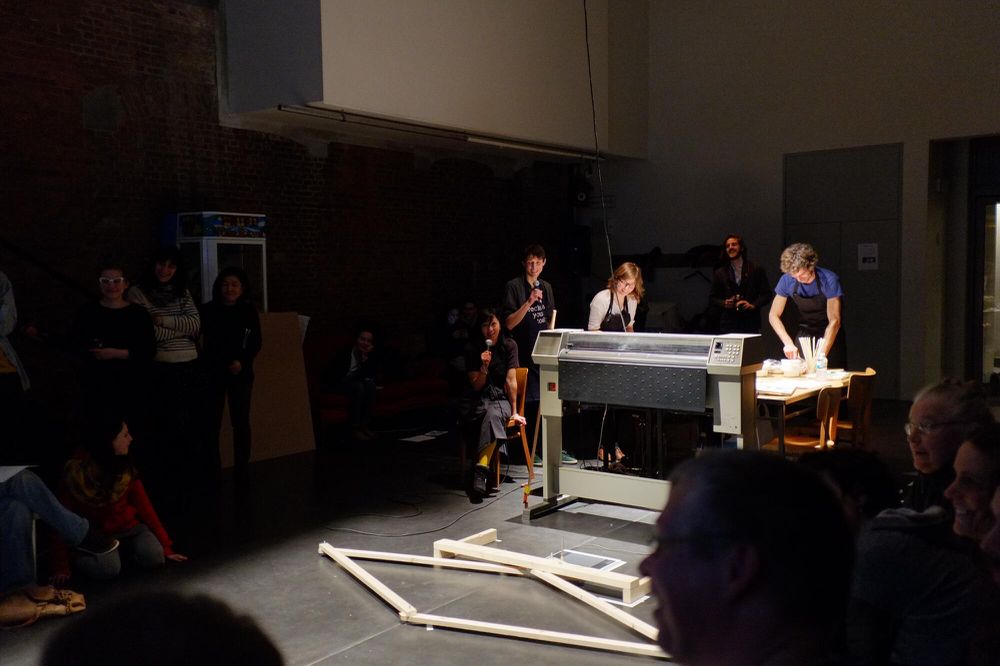
<p>OSP is happy to invite you to a print party and a performance Up Pen Down.</p>
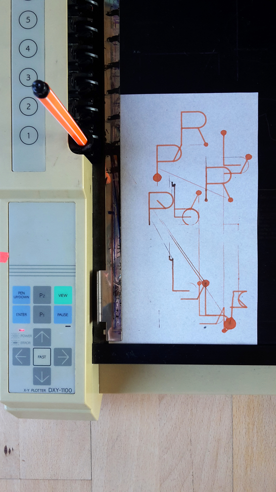
<img style="max-width:600px;" src="http://ospublish.constantvzw.org/images/var/albums/Up-pen-down--01/2015-10-25%2016_44_47.jpg?m=1492279209">
<p>Where: Theatre La Balsamine, Félix Marchallaan 1, 1030 Schaarbeek, Brussels
<br>When: Saturday 14 October at 20:30.
<br>Language: EN
<br>Duration: ~1:30
<br>In the frame of festival Saison des cultures numériques.</p>
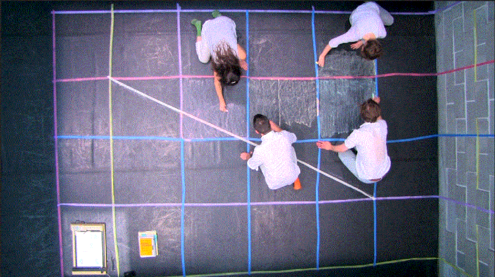
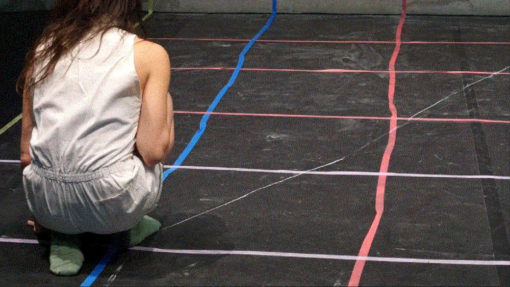
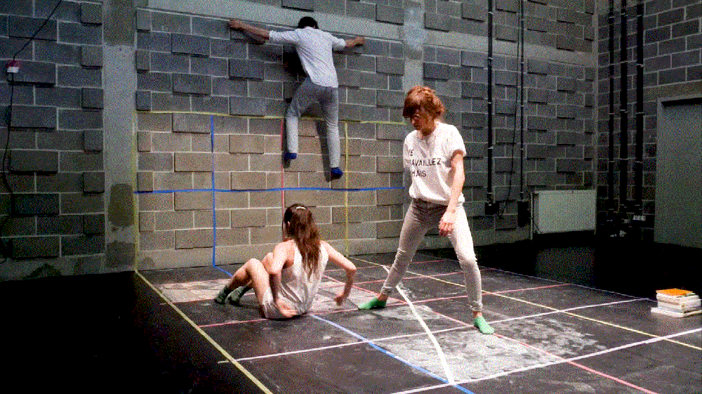
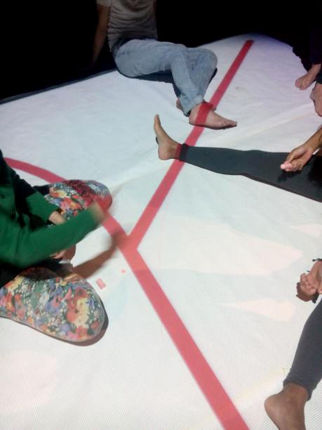
<p>This event is inspired by an ongoing research focused on that which is between digital type design and bodies. We will share our findings and open questions with the public - letters and movements, dance notation and programing, digital codes and gestural language, ploters and body parts will duet with each other and hopefully confuse, even if just a little, the distinction between choreographic and digital practices. We will perform a publication, or rather print a performance. We will welcome you on stage, where we will move, type, talk, draw, read and write, until eventually our actions will find their way into a booklet - a present for you, with which we will greet you goodbye.</p>
<p>→ For more information, see:
<br><a href="http://saisonnumerique.be/">http://saisonnumerique.be/</a>
<br><a href="http://balsamine.be/saison-17-18/up-pen-down-en.html">http://balsamine.be/saison-17-18/up-pen-down-en.html</a>
<br><a href="http://osp.kitchen/live/up-pen-down/">http://osp.kitchen/live/up-pen-down/</a>
</p>
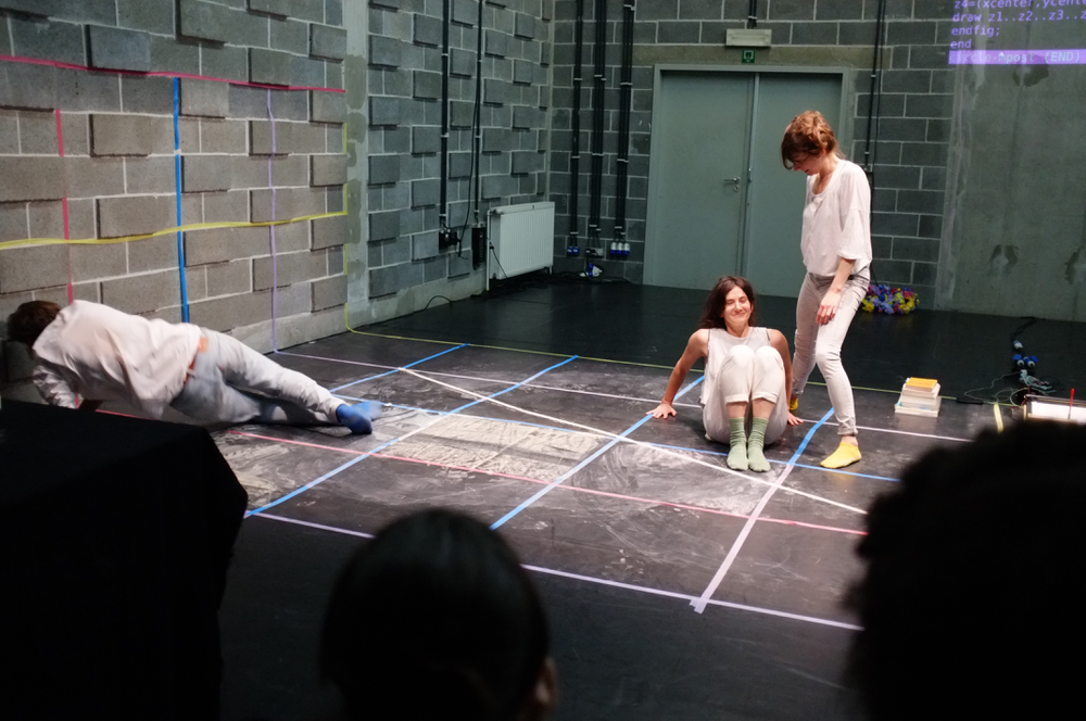
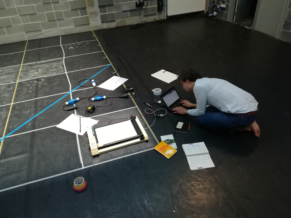
<img style="max-width:600px;" src="https://cloud.osp.kitchen/s/fC0mEtLVrKrlEEp/download">
<p>
Concept and performance: Gijs de Heij, Pierre Huyghebaert, Ludi Loiseau, Adva Zakai
<br>Regard extérieur: Sarah van Lamsweerde, Louise Baduel
<br>With the support of Fédération Wallonie-Bruxelles Arts numériques, VGC, La Balsamine
</p>
<p><a href="http://balsamine.be/">Balsamine theater, Félix Marchallaan 1, 1030 Schaarbeek</a></p>
<br>
</td>
</tr>
</table>
</td>
</tr>
<tr>
<td height="10" style="font-size:10px; line-height:10px;"> </td>
</tr>
</table>
</td>
</tr>
</table>
</center>
<br>
<br>
</body>
</html>