
The Alfphabet family is based on the Belgian road signage lettering called ‘Alphabet’ in French and ‘Alfabet’ in Dutch.
Direct links to download the fonts:
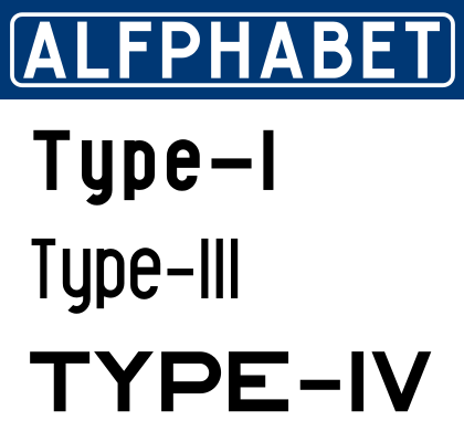
Alfphabet-I.otf (regular)
Alfphabet-III.otf (condensed)
Alfphabet-IV.otf (extended)
Historical background
It seems that the lettering systeme is introduced in 1945 by 3M system working for the Marshall plan after the end of the war. In 1975, it is replaced by the Swiss SNV fonts, but is in 2018 still in used randomly by the Belgian railroad and Charleroi’s metro. In the early nineties, Pierre Huyghebaert is able to copy the original plates just before the split of the national office of the roads ‘Fond des Routes’ in three regional entities and the burial of the documents deep into regional archives.
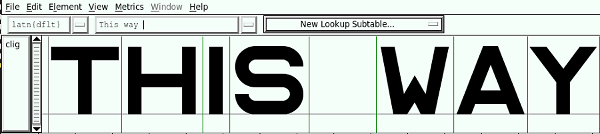
Alfphabet III (condensed) is in fact a rough merge between Alfphabet II (condensed caps only) and Alfphabet III (semi-condensed lowercase only!). It is redrawn in various occasions by Karl Bassil and Pierre under Hammerfonts umbrella in Brussels at mid-nineties, then completed at Mind the gap studio in Beirut by Karl with the help of Nadim Zablit in the late nineties. The contrast between uppercase and lowercase is still quite non-typographic, and lots of diacritics need improvement.
Alfphabet IV is redrawn by Pierre and Ludi Loiseau at Speculoos studio in 2007.
At the time of the writing of this documentation, we do not remember precisely when Alfphabet I was drawn.
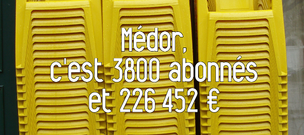
Article en français dans le magazine Médor
Une police du royaume Dans la rubrique "Trait belge, nos territoires graphiques" Pierre Huyghebaert - Médor N°1, Hiver 2015-2016
Dans ses pages, Médor profite d’un second souffle de la police Alfphabet. Ce caractère typographique belge des années 1940, encore vaguement utilisé par la SNCB, tend à disparaître.
À la fin des années 1940, le plan Marshall amène dans ses valises quelques contrats de signalétique routière pour la firme 3M et ses films réfléchissants. Le caractère typographique standard des panneaux routiers est baptisé, avec beaucoup d’inspiration administrative, «Alfabet» en néérlandais et «Alphabet» en français.
Vers 1970, l’augmentation de la vitesse sur les routes demande une plus grande lisibilité des panneaux routiers. Le graphiste barbu Michel Olyff et des scientifiques de l’université de Louvain développent alors un système typographique alternatif plus en phase avec les goûts et les besoins de l’époque (publié dans Infordesign, magazine du Design Center, 1970). Mais, bardaf, le prix qu’ils demandent (800000 francs belges de l’époque) dépasse de loin l’ambition du fonctionnaire responsable. Il opte derechef pour la police routière suisse, la SNV, gratuite, elle!
Trente ans plus tard, l’Alfphabet indique toujours l’entrée en gare de Bruxelles-Nord, la direction de Jandrain-Jandrenouille ou quelque déviation/wegomlegging. La SNCB, qui a continué benoîtement à l’utiliser jusqu’à présent, commence à l’abandonner, au hasard des rénovations et au profit d’internationales polices bien lisses ou de copies bien nazes.
(Médor utilise parmi d’autres fontes libres une version de l’Alfphabet redessinée à Beyrouth et à Bruxelles depuis la fin des années nonante. Elle est disponible avec plus d’informations, comme le reste de la typographie de ce numéro, sur medor.coop/fontes)
Backstage
2011/9/17 Benoit Brunel <
xxx@gmail.com>:
Justement ça concerne l’article, j’ai besoin de quelques informations
et je sais que tu as les réponses.
Tu me disais que Michel Olive avait proposé un système de fonts pour…
la SNCB ou la STIB ?
Pour les deux, quel est le système en place? D’où vient-il? Belge?2011/10/2 Pierre Huyghebaert <
xxx@speculoos.com>
Michel Olyff a répondu à un appel de ce qui s’appelait le fond des routes, national, vers 1975.
Ils utilisaient jusque là des caractères que les planches appellaient Alfabet ou Alphabet selon la langue.
Il y avait le type I, II, III, IV et V soit des chasses différentes en majuscules et une “police” juste pour les minuscules!
Son nouveau système signalétique une fois au point, très moderniste type Frutiger, il a fait produire une étude comparative de lisibilité, sur un mode scientifique typique des années 70.
Mais le fonctionnaire cadre en poste à l’époque, que j’ai rencontré à la fin de sa carrière et juste après le démantèlement régional de son institution fin des années 90, m’a expliqué avoir reculé devant le prix demandé par Olyff, pourtant raisonnable : 800000 francs belges soit 20000 euros, qui à l’époque devait bien valoir le double. Il a décidé d’opter pour la SNV suisse, gratuite…
La SNCB continue parfois a utiliser l’Alfphabet, vaille que vaille, dans des versions très mal vectorisées, et mélangées au pire, type Arial.
La STIB l’a aussi utilisé mais a depuis longtemps varié ses choix, largement vers l’Helvetica dans la métro, et depuis quelques années avec son changement d’identité, une fonte custom humanistique à la hollandaise.
Content of the directory
- Type-I (Actually Type-I uppercase with Type-V lowercase)
- UFO & OTF files
- SFD working file
- Type-III (Actually Type-III uppercase with Type-V readapted-lowercase)
- UFO & OTF files
- SFD working file
-
Type-IV (Type-IV is uppercase only)
- UFO & OTF files
- SFD working file
-
Fontlog
-
OFL Licence + FAQ
Known issues and future developments
-
Diacritics need improvement
-
Contrast between uppercase and lowercase (Type-I/III) is still quite non-typographic
Coverage
-
Alfphabet I currently provides the following Unicode coverage:
- Basic Latin: 93/95
- Latin-1 Supplement: 66/96
- Latin extended A: 4/128
-
Alfphabet III currently provides the following Unicode coverage:
- Basic Latin: 95/95
- Latin-1 Supplement: 95/96
- Latin extended A: 3/128
-
Alfphabet IV currently provides the following Unicode coverage:
- Basic Latin: 95/95
- Latin-1 Supplement: 60/96
Information for Contributors
Copyright 1992-2014 Hammerfonts and OSP (Karl Bassil, Nadim Zablit, Pierre Huyghebaert, Ludivine Loiseau).
Alfphabet is released under the OFL 1.1 -- http://scripts.sil.org/OFL For information on what you're allowed to change or modify, consult the ofl.txt and ofl-faq.txt files. The ofl-faq also gives a very general rationale and various recommendations regarding why you would want to contribute to the project or make your own version of the font.
ChangeLog
To do
Acknowledgements
If you make modifications be sure to add your name (N), email (E), web-address (W) and description (D).
This list is sorted by last name in alphabetical order.
N: Karl Bassil
E: karl.bassil@mindthegap.com.lb
W: http://www.mindthegap.com.lb
D: Typography
N: Pierre Huyghebaert
E: pierre@speculoos.com
W: http://www.speculoos.com
D: Typography
N: Ludi Loiseau
E: hello@ludi.be
W: http://www.ludi.be
D: Typography
N: Nadim Zablit
E: nadim.zablit@scopeateliers.com
W: http://scopeateliers.com
D: Typography