Download raw (11.3 KB)
--- Title: NaturArchy exhibition design Date: 2024-06-04 16:03 Authors: Simon, Clara Tags: bioink, plotter, Inkscape, HPGL, Hershey Slug: naturarchy-exhibition-design Status: published --- ## Introduction OSP were commissioned by iMAL to design a graphic identity for the exhibition [NaturArchy: Towards a Natural Contract](https://www.imal.org/en/events/naturarchy), taking place in Brussels, from the 25.05 till 29.09.2024. As the exhibition is comprised of art/science collaborations on the theme of nature, we began with an intention to experiment with pen plotters and bio inks. The bio inks were previously used in a [2018 collaboration](https://plotterstation.osp.kitchen/library.html#colorlab) between OSP and María Boto Ordonez, a scientist working at the [Laboratorium](http://laboratorium.bio). ## Pen plotters A pen plotter is a machine that draws. Or rather, a machine that takes instructions to plot coordinates on the x- and y- axes with a pen, while it is up or down. These machines pre-date the modern office printer as a way to output vector graphics on paper. 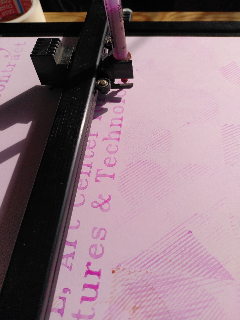 Using a pen plotter is a slow, musical process. We found the "songs" it made came from the shapes it was drawing - the pitch depending on the angle of the line. A plotted circle (which is in reality not a continuous curve, but rather a series of small increments of points) produced a musical run through a wide range of notes. Often we could know which drawing it was making by the song it was playing. Drawing the same shape (for example a flower) in two different sizes, would create the same melody but at a different speed, the small flower playing at a higher tempo. Pen plotters speak a language called HPGL (Hewlett Packard Graphics Language), which has a relatively simple syntax. HPGL uses commands such as SP (Select Pen), PU (Pen Up), PD (Pen Down), PA (Plot Absolute), PR (Plot Relative) and LT (Line Type). For very expanded documentation, the [Isoplotec website](https://www.isoplotec.co.jp/HPGL/eHPGL.htm) is a good resource. 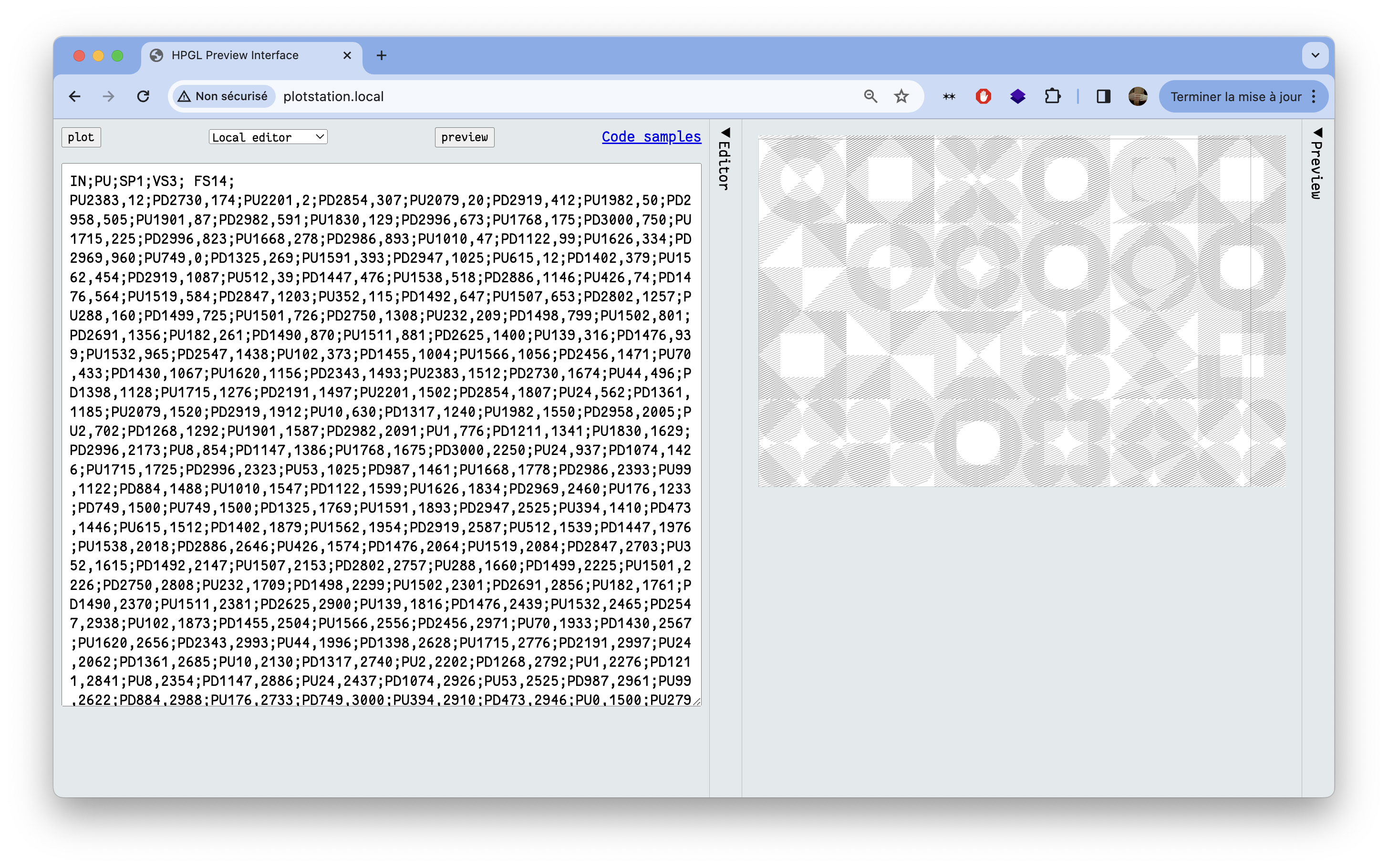 There is quite a collection of pen plotters available to use within the newly-created [plotter station at OSP](http://plotterstation.osp.kitchen/). The machine that we used was a Roland DXY-1100. It holds A3 sheets of paper electrostatically in place for a pen to move over it. After the machine is initialised, the plotter picks up a pen from one of eight slots in the carousel. The thickness of the lines it will draw depends on the type of pen, and specifically the width of its nib. We used both commercially manufactured Stabilo brand pens for synthetic ink and refillable pens to hold the bio inks. As the pens we were using were not manufactured specifically for pen plotters, we had to fit a 3D-printed adaptor that the machine would be able to hold. Several methods for making fine adjustments in the vertical alignment have been [improvised](https://pzwiki.wdka.nl/mediadesign/Pen_plotters#Vertical_alignment_tools) by other pen plotter enthusiasts, such as the students of XPUB (Experimental Publishing) Master at the Piet Zwart Institute in Rotterdam. We did not have such a vertical alignment tool, but instead improvised with masking tape, trial and error. It’s hard to seek total control and perfection with the pen plotter: sometimes it’s not grabbing the pen, it’s pushing too hard, sometimes the bio inks are too dry leaving no mark, or too inky creating liquid stains. It is this uncertainty we cherished but which also required us to stay next to the machine all the time, either fixing the mistakes by hand, or embracing them and watching them happen, mesmerised. After some time, the pen plotter felt like a companion or a pet, that we had to feed and take care of. It had its own personality, being always surprising and nonlinear. We caught ourselves several times silently smiling and observing its every move, rocked by its melody. Like a proud parent, our phones were full of videos of its actions. ## Bio inks The bio inks we used for this project are created by María at the Laboratorium, a biolab located within the Media Arts Studio at the Royal Academy of Fine Arts (KASK) in Ghent. They are made with natural pigments and algaes, and they naturally disappear when placed in direct exposure to sunlight. We decided to work with this ephemerality, imagining having posters with some details almost completely faded out by the end of the exhibition. 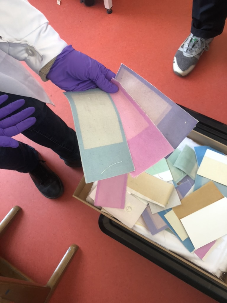 Before visiting María’s biolab, we made some experiments by plotting with “natural” inks we made from materials we found at the OSP studio: soy sauce, turmeric and coffee. The result was exciting but very pale and only brownish in hue. The aspect of these inks when used on paper is very close to watercolour, it’s very pale, fluid and had a fragile feel. At her biolab in Ghent, María generously gave us some new bio inks: a very bright pink, a deep blue, an orange and a green, which were much more interesting to work with. Because María is working more with structured color these days than with bio inks, she still had some reserves left over. 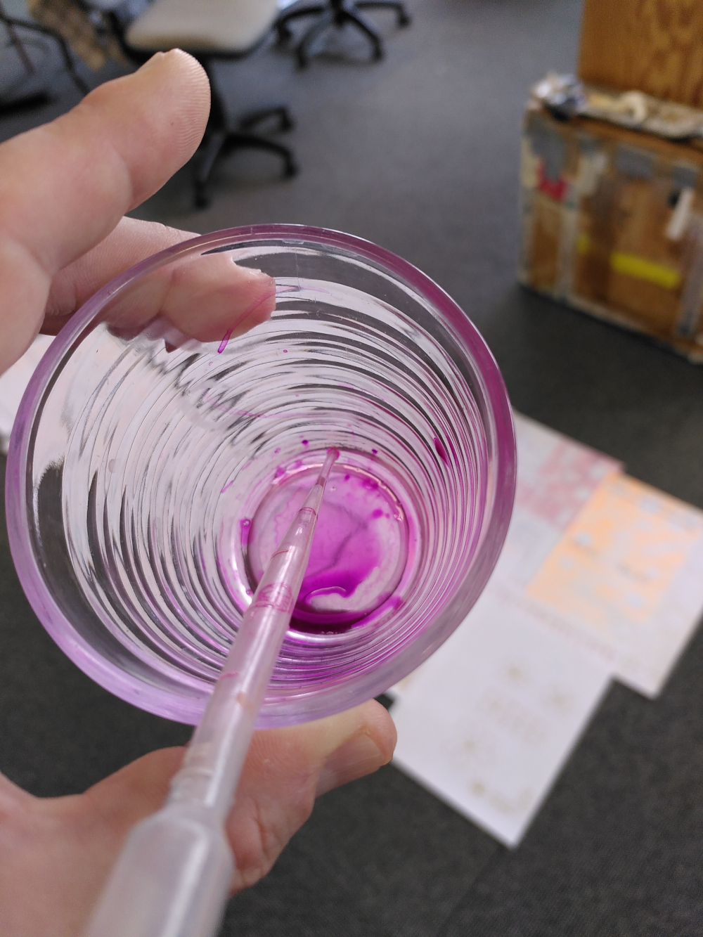 Some inks worked great and without needing close assistance, for example the pink was very fluid but dense and the result was very bright. In contrast, the green was hard to mix and was very pale, almost invisible. The timeframe for this project was super short, so we didn't have much time to experiment. With more time we'd like to dig a bit deeper into different fluids to mix the pigments with (such as alcohol, or oil). 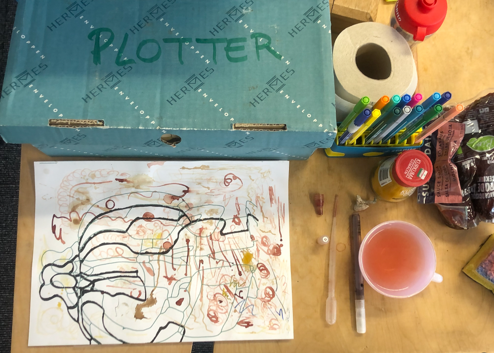 ## The poster series Our initial research involved trying out making patterns that used the shapes of iMAL's identity (circle, square, triangle, diamond). These shapes provided a basic starting point from which to understand HPGL. To draw a line, the pen plotter needs instructions where to take the raised pen to. These come in the form of a direction to move the raised pen to a set of coordinates. Then a direction to put the pen down and move it to another set of coordinates. In this way, the machine uses HPGL to draw the outlines of shapes, and crosshatch fills for them. We generated patterns in HPGL using a python script. These created a series of moiré effects that we could directly send to the pen plotter. We tried also with a stereotypical flower drawing, using only basic curves, and other typographic experiments. The fonts we used come from the [Hershey](https://lapolice.ch/stories/footnotes-b-article-9/) typeface. These were generated from an extension of the software Inkscape. We chose to use Hershey fonts as they are monoline fonts, meaning that they are composed from lines. This makes them therefore suitable for a pen plotter, which draws lines but not fills. First, we had to use an inkjet printer to print all the partner’s logos at the bottom of the poster. Plotting all of these legibly would have been a real challenge. It was risky, since the outcome would have created too much change to the logos, which needed to remain intact. A big pile of coloured paper with only small logos at the bottom was then ready to be plotted. The default Clairefontaine paper is usually very popular for printing, we used this type since we had some leftover at the OSP studio. 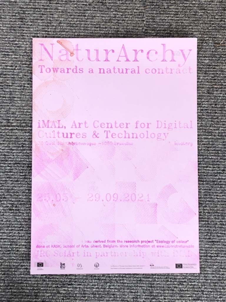 We plotted from 10am till 10pm for three days approximately, to produce a total of 42 posters for the exhibition. Each poster is structured with informative text: the title of the exhibition, the location, the dates, a context sentence about the bio inks, and credits about the partners of the exhibition. Those rather formal assets served to structure the posters and let us play around with the background elements. No two posters are the same. Sometimes we had to readjust the pen position by hand, some pens drew clearly, and others left stains and blobs of bio ink. We composed them in the moment, laying them out on the floor in the studio to see them together, while trying out different inks and shapes. After scanning all 42 posters, they were sent to iMAL with instructions to attach them to their large glass windows near the entrance. We're most curious to see how the duration of the exhibition will change them. 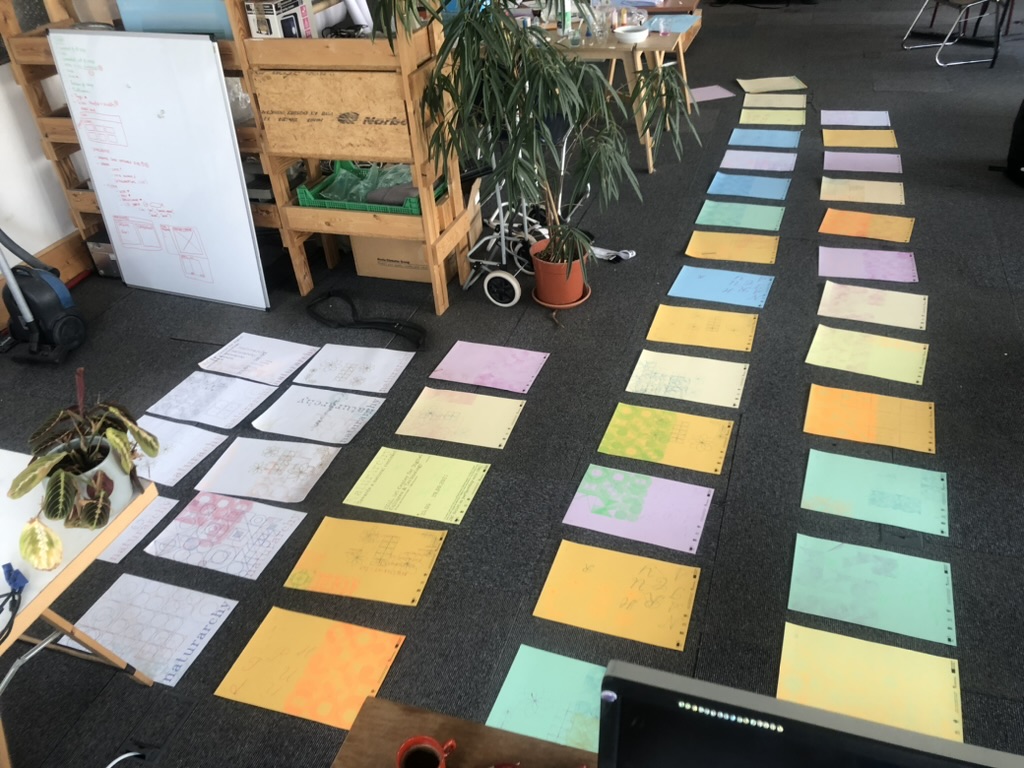 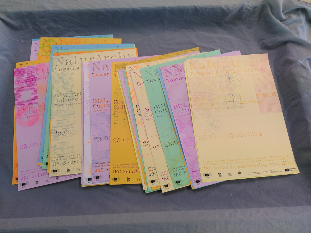 ## The other exhibition assets Alongside the posters, we also produced other assets for the exhibition, including designs for introduction text, exhibition title, captions for the artworks, flyers and a digital kit of imagery to use online. At the end of plotting process, we had some spare sheets with logos at the bottom. We recycled them and asked iMAL to use them to display the introduction text at the entrance of the exhibition. 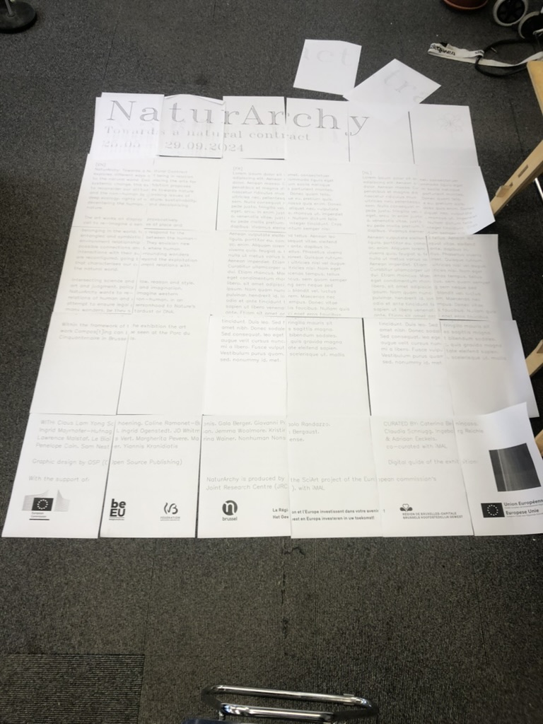 As for the title of the exhibition, we mimicked the drawing process of the plotter. Usually, vinyl is applied to the glass outside of iMAL for exhibition titles, as it is a weather-resistant material. However, we decided to not use vinyl, opting instead for water-based paint. We printed the text that would be displayed on A3 sheets, which were then stuck together, one for each glass panel. These were then placed on the glass inside iMAL, and the lines of the Hershey fonts were traced by hand on the glass outside of the space. When it rains (as it often does in Brussels), the paint may wear. It can then be traced again as long as the exhibition is on display. The captions of the artworks have been laser engraved directly at iMAL since they have a wood workshop and a laser cutting machine. With the gesture being similar to the pen plotter (sending a file to a machine that draws), it was an efficient reference of our initial process. We were asked to deliver 2000 flyers to promote the exhibition. As this volume was unreasonable to produce with the pen plotter, we printed them using the Risograph technique at [R·DRYER STUDIO](https://rdryerstudio.com/). This seemed a good alternative, since Risograph has a crafty and “imperfect” aspect and also is more ecologically sound than an offset or digital commercial printing process. We could produce the flyers locally in Brussels, in dialogue with the printer. The process felt also similar to the posters since each layer of the flyer was printed with ink in different colours. Finally, we delivered a “digital kit” which consisted of scans of selected posters, that had different levels of legibility. We selected them from a range of very legible posters to more experimental and stained versions. Each poster could be cropped as a square or a rectangle, for different social media purposes. The scanned posters have a particular materiality which felt interesting to see on the usually sleek and perfect screen.