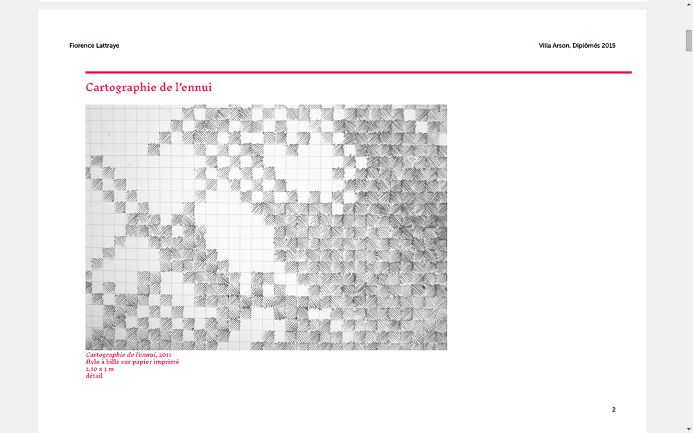
Download raw (9.6 KB)
/* the geometry of the page */
/* the size of the crop marks*/
/* the size of bleed */
@import "assets/css/reset.css";
/**
 * Computation
 */
/* EXTRA SPACE AROUND THE PAGE: BLEED + CROP */
/* GEOMETRY OF THE PAPER SHEET */
/* SIZE OF SPREAD */
/**
 * DEFINITION OF THE PAPER SHEET
 */
@page {
  size: 297mm 213mm;
  margin: 0;
}
/**
 * CANVAS
 */
@media all {
  body {
    margin: 0;
  }
  .paper {
    width: 297mm;
    height: 208mm;
    box-sizing: border-box;
    /* Crop marks */
    padding: 0mm;
    counter-increment: page-counter;
    /* utile ou non? pour éviter qu'un papier soit coupé par le format de la
        * page lors de la conversion et l'arrondis des unités */
    page-break-inside: avoid;
    overflow: hidden;
    /* Crop marks */
    background-image: -webkit-linear-gradient(90deg, black 0, black 100%), -webkit-linear-gradient(0deg, black 0, black 100%), -webkit-linear-gradient(90deg, black 0, black 100%), -webkit-linear-gradient(0deg, black 0, black 100%), -webkit-linear-gradient(90deg, black 0, black 100%), -webkit-linear-gradient(0deg, black 0, black 100%), -webkit-linear-gradient(90deg, black 0, black 100%), -webkit-linear-gradient(0deg, black 0, black 100%);
    background-size: 0mm 1px, 1px 0mm, 0mm 1px, 1px 0mm, 0mm 1px, 1px 0mm, 0mm 1px, 1px 0mm;
    background-position: left 0mm, 0mm top, right 0mm, 297mm top, right 208mm, 297mm bottom, left 208mm, 0mm bottom;
    background-repeat: no-repeat;
  }
  .h2p-page {
    width: 297mm;
    height: 208mm;
    box-sizing: border-box;
    position: absolute;
    text-rendering: optimizeLegibility;
  }
}
@media screen {
  body {
    background-color: #F0F0F0 !important;
  }
  #pages {
    width: 297mm;
    height: 208mm;
    margin-left: auto;
    margin-right: auto;
  }
  .spread #pages {
    width: 594mm;
    height: 416mm;
  }
  .paper {
    /* centrer la page à l'écran */
    background-color: white;
    margin-top: 1em;
    margin-bottom: 1em;
  }
}
@media print {
  html {
    width: 297mm;
  }
  body {
    /* Allows printing of background colors */
    background-color: white;
    -webkit-print-color-adjust: exact;
    print-color-adjust: exact;
  }
  #pages {
    position: absolute;
    top: 0;
  }
}
/**
 * Helpers
 */
.region-break {
  /* Apply this class to an element to put it on a new region.
     * Hint:
     * You can also use an empty <div class="page-break"></div>
     * if you want to put manual page breaks without attaching it to an HTML element
     */
  -webkit-region-break-before: always;
}
.header,
.body,
.footer {
  box-sizing: border-box;
}
/* __________________________________ HEADER __________________________________ */
.header {
  /*position: absolute;*/
  /*margin-top: @page-margin-top;*/
  margin: 0;
  padding-top: 15mm;
  height: 20mm;
  text-align: left;
  padding-right: 15mm !important;
}
.header:after {
  content: "Villa Arson, Diplômés 2015";
  right: 15mm !important;
}
/* __________________________________ MAIN SECTION __________________________________ */
.body {
  height: 173mm;
  width: 100%;
  padding-top: 19.5px;
  overflow: hidden;
}
#my-story {
  width: 297mm;
}
/* __________________________________ FOOTER __________________________________ */
.footer {
  margin: 0;
  width: 100%;
  height: 5mm;
  text-align: center;
}
.footer:after {
  content: counter(page-counter);
}
/* for spreads only */
.paper:nth-child(odd) .header {
  text-align: right;
}
.paper:nth-child(odd) .header,
.paper:nth-child(odd) .body,
.paper:nth-child(odd) .footer {
  padding-left: 15mm;
  padding-right: 15mm;
}
.paper:nth-child(even) .header,
.paper:nth-child(even) .body,
.paper:nth-child(even) .footer {
  padding-left: 15mm;
  padding-right: 15mm;
}
body {
  text-rendering: optimizeLegibility;
}
img {
  max-width: 100%;
}
h1,
h2,
h3,
h4,
h5,
h6 {
  /* Avoids headings to be cut or to be orphans.
     * But it doesn't seem to work
     * if the element after has a page-break-inside avoid. It tries its best! */
  -webkit-region-break-inside: avoid;
  -webkit-region-break-after: avoid;
  break-inside: avoid;
  break-after: avoid;
}
/* AN EXAMPLE TO AVOID PAGE BREAK INSIDE,
 * HERE NO PARAGRAPH WILL BE CUT,
 * BUT YOU MIGHT WANT TO DEACTIVATE THIS */
p {
  /*-webkit-region-break-inside: avoid;*/
}
* {
  -webkit-font-feature-settings: "liga", "dlig", "clig", "kern";
}
.debug .header {
  outline: 1pt solid pink;
}
.debug .body {
  outline: 1pt solid purple;
}
.debug .footer {
  outline: 1pt solid pink;
}
/* __________________________________ IMAGES __________________________________ */
/* Use those classes for images to fit width or height of parent elements or both. */
img.fit-height {
  height: 100%;
}
img.fit-width {
  width: 100%;
}
@font-face {
  font-family: "Inknut Antiqua";
  src: url("assets/fonts/InknutAntiqua-Regular.ttf");
}
@font-face {
  font-family: "Museo Sans";
  src: url("assets/fonts/MuseoSans_500.otf");
  font-style: normal;
}
@font-face {
  font-family: "Museo Sans";
  src: url("assets/fonts/MuseoSans_500_Italic.otf");
  font-style: italic;
}
/* -------------------------------------------- VARIABLES ----------------------------------------- */
/* -------------------------------------------- FLOW ----------------------------------------- */
.recipient {
  flow-from: myStory;
}
#main {
  flow-into: myStory;
}
/* -------------------------------------------- GENERIC CLASSES ----------------------------------------- */
html,
body {
  width: 267mm;
}
body {
  font-family: 'Inknut Antiqua', serif;
  font-size: 15px;
  line-height: 19.5px;
}
#main {
  width: 267mm;
}
h1,
h2 {
  color: inherit;
}
p {
  margin: 0px;
}
p + p {
  text-indent: 39px;
}
a {
  text-decoration: none;
  color: inherit;
}
em {
  font-style: italic;
}
div.column {
  float: left;
  padding: 0 9.75px;
  height: 100%;
  box-sizing: border-box;
}
div.column90 {
  width: 90%;
}
div.column60 {
  width: 60%;
}
div.column50 {
  width: 50%;
}
div.column33 {
  width: 33%;
}
div.column25 {
  width: 25%;
}
/* -------------------------------------------- HEADER ----------------------------------------- */
.header {
  font-size: 11.53846154px;
  text-align: left !important;
  font-family: "Museo Sans";
  font-style: normal !important;
}
.header:after {
  position: absolute;
  right: 0;
  font-size: 11.53846154px;
  font-style: normal !important;
}
.header .mentiondiplomes {
  display: none;
}
.header .notes {
  font-size: 11.53846154px !important;
  font-family: 'Inknut Antiqua', serif;
  text-indent: 0px;
}
.header p {
  margin-bottom: 0px;
}
#page-1 .header {
  font-size: 11.53846154px;
}
#page-1 .header .mentiondiplomes {
  display: inline;
  font-size: 11.53846154px;
  font-style: italic !important;
}
.footer {
  text-align: right;
  font-size: 11.53846154px;
  font-family: "Museo Sans";
}
#colophon {
  position: absolute;
  bottom: 10mm;
  left: 15mm;
  font-size: 11.53846154px;
  font-family: "Museo Sans";
}
/* -------------------------------------------- INTRODUCTION ----------------------------------------- */
#intro {
  font-size: 21px;
  line-height: 28px !important;
  -webkit-region-break-after: always;
  break-after: always;
  color: #FF004A;
}
#intro p {
  text-indent: 78px;
  max-width: none;
  margin-bottom: 0px!important;
  break-inside: avoid;
}
#intro p:last-child,
#intro #signature {
  font-size: 15px !important;
}
h1,
.mentiondiplomes {
  display: none;
}
/* -------------------------------------------- MAIN CONTENT ----------------------------------------- */
.container {
  margin-left: 39px;
}
.fusion-post-large {
  -webkit-region-break-after: always;
  break-after: always;
  clear: both;
  margin-bottom: 39px;
  font-size: 15px;
  line-height: 19.5px;
}
h2 {
  clear: both;
  margin-bottom: 7.8px;
  border-top: 4px solid ;
  font-size: 20.25px;
  line-height: 29.25px;
  padding-top: 10px;
}
.fusion-post-content-container {
  display: flex;
  flex-direction: row;
  flex-wrap: wrap;
  align-content: flex-end;
  justify-content: space-between;
  display: -webkit-flex;
  -webkit-flex-direction: row;
  -webkit-flex-wrap: wrap;
  -webkit-align-content: flex-end;
  -webkit-justify-content: space-between;
}
.picture {
  -webkit-region-break-inside: avoid;
  break-inside: avoid;
  width: 30%;
  margin-right: 19.5px;
  margin-bottom: 13px;
}
img {
  object-fit: contain;
  object-position: bottom left;
  max-height: 5cm;
}
figcaption {
  font-size: 10px;
  line-height: 13.92857143px;
}
figcaption.idem {
  width: 5em;
  height: 1em;
  border-bottom: 2px solid;
}
.picture:only-child {
  width: 100%;
}
.picture:only-child img {
  max-height: 12cm;
}
.text {
  width: 60%;
  padding-right: 7px;
}
.notes {
  margin-top: 7px;
  margin-bottom: 10px;
  font-size: 10px;
  line-height: 9.75px;
}
.sectiondetexte {
  width: 50%;
}
.text .sectiondetexte {
  width: 100%;
}
h1.entry-title {
  margin-top: 0;
}
p.mentiondiplomes {
  text-indent: 0;
}
.fusion-video iframe,
.fusion-soundcloud iframe {
  display: none;
}
.fusion-video,
.fusion-soundcloud {
  color: inherit;
  font-family: "Museo Sans";
  border: solid 8px /*gray*/;
  background-color: #F5F5F5;
  padding: 12px 14px 16px 14px;
  font-size: 11.53846154px;
  max-width: 50%;
  word-break: break-word;
  line-height: 16.25px;
  margin-top: 19.5px;
  margin-bottom: 19.5px;
  margin-right: 19.5px;
}
.fusion-video p,
.fusion-soundcloud p {
  text-indent: 0px !important;
}
#contacts {
  font-size: 15px;
  display: flex;
  flex-wrap: wrap;
  flex-direction: row;
  justify-content: space-around;
  color: #191970;
  break-inside: avoid;
}
#contacts h2 {
  flex-basis: 100%;
}
#wpadminbar,
.fusion-footer {
  display: none;
}
body.chemin-de-fer {
  width: 1188mm;
}
body.chemin-de-fer #pages {
  width: 1188mm;
  transform-origin: 0 0;
  transform: scale(0.33);
}
body.chemin-de-fer .paper {
  float: left;
  margin: 1em;
}