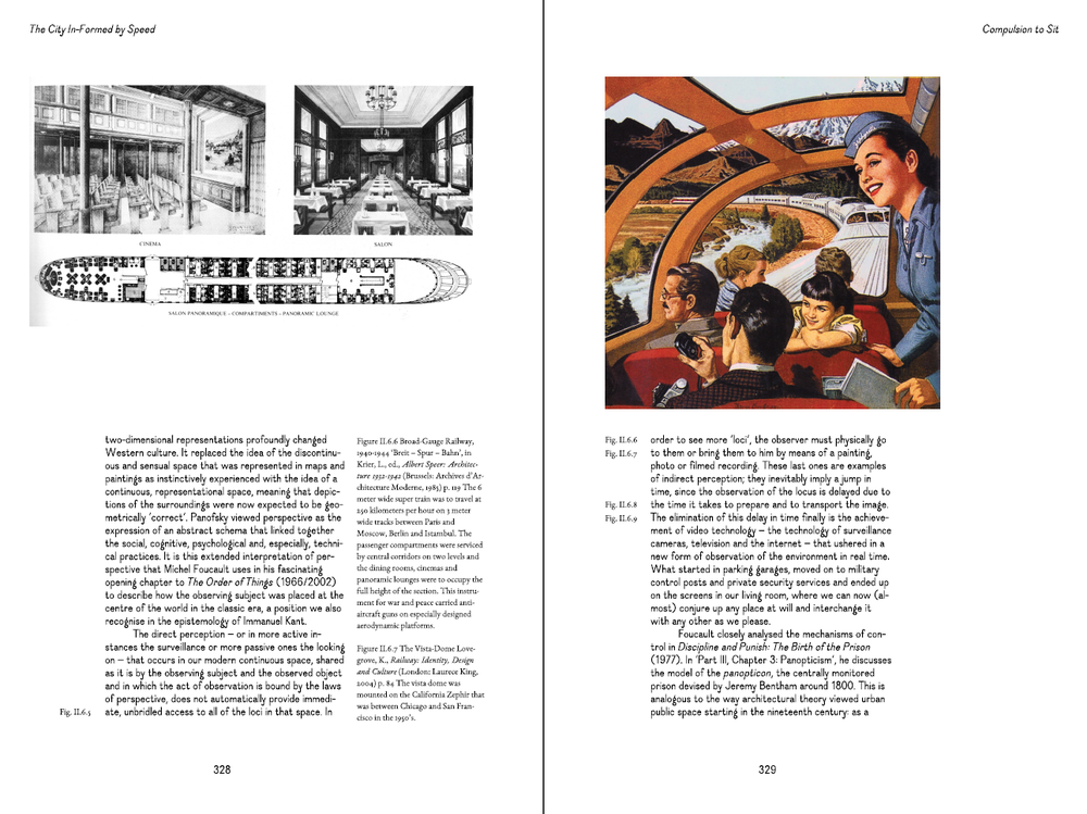
Download raw (8.9 KB)
@import "/assets/css/reset.css";
/* the geometry of the page */
/* the size of the crop marks*/
/* the size of bleed */
/**
 * Computation
 */
/* EXTRA SPACE AROUND THE PAGE: BLEED + CROP */
/* GEOMETRY OF THE PAPER SHEET */
/* SIZE OF SPREAD */
/**
 * DEFINITION OF THE PAPER SHEET
 */
@page {
  size: 224mm 329mm;
  margin: 0;
}
/**
 * CANVAS
 */
@media all {
  body {
    margin: 0;
  }
  .paper {
    width: 224mm;
    height: 324mm;
    box-sizing: border-box;
    /* Crop marks */
    padding: 12mm;
    counter-increment: page-counter;
    /* utile ou non? pour éviter qu'un papier soit coupé par le format de la
        * page lors de la conversion et l'arrondis des unités */
    page-break-inside: avoid;
    overflow: hidden;
    /* Crop marks */
    background-image: -webkit-linear-gradient(90deg, #000000 0, #000000 100%), -webkit-linear-gradient(0deg, #000000 0, #000000 100%), -webkit-linear-gradient(90deg, #000000 0, #000000 100%), -webkit-linear-gradient(0deg, #000000 0, #000000 100%), -webkit-linear-gradient(90deg, #000000 0, #000000 100%), -webkit-linear-gradient(0deg, #000000 0, #000000 100%), -webkit-linear-gradient(90deg, #000000 0, #000000 100%), -webkit-linear-gradient(0deg, #000000 0, #000000 100%);
    background-size: 5mm 3px, 3px 5mm, 5mm 3px, 3px 5mm, 5mm 3px, 3px 5mm, 5mm 3px, 3px 5mm;
    background-position: left 12mm, 12mm top, right 12mm, 212mm top, right 312mm, 212mm bottom, left 312mm, 12mm bottom;
    background-repeat: no-repeat;
  }
  .h2p-page {
    width: 200mm;
    height: 300mm;
    box-sizing: border-box;
    position: absolute;
    text-rendering: optimizeLegibility;
  }
}
@media screen {
  body {
    background-color: #F0F0F0 !important;
  }
  #pages {
    width: 224mm;
    height: 324mm;
    margin-left: auto;
    margin-right: auto;
  }
  .spread #pages {
    width: 448mm;
    height: 648mm;
  }
  .paper {
    /* centrer la page à l'écran */
    background-color: white;
    margin-top: 1em;
    margin-bottom: 1em;
  }
}
@media print {
  html {
    width: 224mm;
  }
  body {
    /* Allows printing of background colors */
    background-color: white;
    -webkit-print-color-adjust: exact;
    print-color-adjust: exact;
  }
  #pages {
    position: absolute;
    top: 0;
  }
}
/**
 * Helpers
 */
.region-break {
  /* Apply this class to an element to put it on a new region.
     * Hint:
     * You can also use an empty <div class="page-break"></div>
     * if you want to put manual page breaks without attaching it to an HTML element
     */
  -webkit-region-break-before: always;
}
.header,
.body,
.footer {
  box-sizing: border-box;
}
/* __________________________________ HEADER __________________________________ */
.header {
  /*position: absolute;*/
  /*margin-top: @page-margin-top;*/
  margin: 0;
  padding-top: 0mm;
  height: 20mm;
  text-align: left;
  padding-right: 22.22222222mm !important;
  outline-color: green;
}
.header:after {
  content: "The riddle of the real city";
  right: 22.22222222mm !important;
}
/* __________________________________ MAIN SECTION __________________________________ */
.body {
  height: 246.66666667mm;
  width: 100%;
  padding-top: 14.5pt;
  overflow: hidden;
}
#my-story {
  width: 200mm;
}
/* __________________________________ FOOTER __________________________________ */
.footer {
  margin: 0;
  width: 100%;
  height: 33.33333333mm;
  text-align: center;
  outline-color: red;
}
.footer:after {
  content: counter(page-counter);
}
/* for spreads only */
.paper:nth-child(odd) .header {
  text-align: right;
}
.paper:nth-child(odd) .header,
.paper:nth-child(odd) .body,
.paper:nth-child(odd) .footer {
  padding-left: 11.11111111mm;
  padding-right: 22.22222222mm;
}
.paper:nth-child(even) .header,
.paper:nth-child(even) .body,
.paper:nth-child(even) .footer {
  padding-left: 22.22222222mm;
  padding-right: 11.11111111mm;
}
body {
  text-rendering: optimizeLegibility;
}
img {
  max-width: 100%;
}
h1,
h2,
h3,
h4,
h5,
h6 {
  /* Avoids headings to be cut or to be orphans.
     * But it doesn't seem to work
     * if the element after has a page-break-inside avoid. It tries its best! */
  -webkit-region-break-inside: avoid;
  -webkit-region-break-after: avoid;
  break-inside: avoid;
  break-after: avoid;
}
/* AN EXAMPLE TO AVOID PAGE BREAK INSIDE,
 * HERE NO PARAGRAPH WILL BE CUT,
 * BUT YOU MIGHT WANT TO DEACTIVATE THIS */
p {
  /*-webkit-region-break-inside: avoid;*/
}
* {
  -webkit-font-feature-settings: "liga", "dlig", "clig", "kern";
}
.debug .header {
  outline: 1pt solid pink;
}
.debug .body {
  outline: 1pt solid purple;
}
.debug .footer {
  outline: 1pt solid pink;
}
/* __________________________________ IMAGES __________________________________ */
/* Use those classes for images to fit width or height of parent elements or both. */
img.fit-height {
  height: 100%;
}
img.fit-width {
  width: 100%;
}
@font-face {
  font-family: 'Ostrich';
  src: url("/assets/fonts/ostrich-bold.ttf") format('truetype');
  font-weight: normal;
  font-style: normal;
}
@font-face {
  font-family: "Dauphine";
  src: url("/assets/fonts/Dauphine-Regular.otf") format('opentype');
  font-weight: normal;
  font-style: normal;
}
@font-face {
  font-family: "Dauphine";
  src: url("/assets/fonts/Dauphine-Italic.otf") format('opentype');
  font-weight: normal;
  font-style: italic;
}
@font-face {
  font-family: "DauphineDings";
  src: url("/assets/fonts/Dauphine-Dings.otf") format('opentype');
  font-weight: normal;
  font-style: normal;
}
@font-face {
  font-family: "Garamond8";
  src: url("/assets/fonts/EBGaramond08-Regular.ttf") format('truetype');
  font-weight: normal;
  font-style: normal;
}
@font-face {
  font-family: "Garamond12";
  src: url("/assets/fonts/EBGaramond12-Regular.ttf") format('truetype');
  font-weight: normal;
  font-style: normal;
}
@font-face {
  font-family: "Garamond12";
  src: url("/assets/fonts/EBGaramond12-Italic.ttf") format('truetype');
  font-weight: normal;
  font-style: italic;
}
@font-face {
  font-family: "Garamond8";
  src: url("/assets/fonts/EBGaramond12-Italic.ttf") format('truetype');
  font-weight: normal;
  font-style: italic;
}
@font-face {
  font-family: "GaramondSC8";
  src: url("/assets/fonts/EBGaramondSC08-Regular.ttf");
  font-weight: normal;
  font-style: normal;
}
@font-face {
  font-family: "GaramondSC12";
  src: url("/assets/fonts/EBGaramondSC12-Regular.ttf");
  font-weight: normal;
  font-style: normal;
}
@font-face {
  font-family: 'Fira Mono';
  src: url('/assets/fonts/FiraMono/EOT/FiraMono-Regular.eot');
  src: url('/assets/fonts/FiraMono/EOT/FiraMono-Regular.eot?#iefix') format('embedded-opentype'), url('/assets/fonts/FiraMono/WOFF2/FiraMono-Regular.woff2') format('woff2'), url('/assets/fonts/FiraMono/WOFF/FiraMono-Regular.woff') format('woff'), url('/assets/fonts/FiraMono/TTF/FiraMono-Regular.ttf') format('truetype');
  font-weight: normal;
  font-style: normal;
}
@font-face {
  font-family: 'RemigtonItalic';
  src: url("/assets/fonts/LTCRemingtonTypewriterPro-Italic.ttf") format('truetype');
  font-weight: normal;
  font-style: normal;
}
/* -------------------------------------------- VARIABLES ----------------------------------------- */
/* -------------------------------------------- FLOWS ----------------------------------------- */
.main-book1 {
  -webkit-flow-from: main-book1;
  flow-from: main-book1;
  float: left;
  top: 16.66666667mm;
  margin: 0;
  width: 100mm;
  height: 233.33333333mm;
}
/* -------------------------------------------- GENERIC CLASSES ----------------------------------------- */
body {
  line-height: 14.5pt;
}
h1,
h2 {
  color: inherit;
}
a {
  text-decoration: none;
  color: inherit;
}
em {
  font-style: italic;
}
div.column {
  float: left;
  padding: 0 7.25pt;
  height: 100%;
  box-sizing: border-box;
}
div.column90 {
  width: 90%;
}
div.column60 {
  width: 60%;
}
div.column50 {
  width: 50%;
}
div.column30 {
  width: 30%;
}
div.column25 {
  width: 25%;
}
/* -------------------------------------------- HEADER ----------------------------------------- */
h2 {
  font-size: 36pt;
  line-height: 29pt;
}
/* -------------------------------------------- BOOK I -----------------------------------------------------------------------------------------------------------------------------------------------------------------------------------------------------------------------------------------------------------------------------------------------*/
/* -------------------------------------------- FOOTNOTES BOOK 1----------------------------------------- */
.content {
  display: block;
  margin: auto;
  max-width: 150mm;
  text-align: left;
}
/* -------------------------------------------- IMAGES BOOK 1----------------------------------------- */
img {
  max-width: 100%;
  position: relative;
}
/* -------------------------------------------- BOOK II -----------------------------------------------------------------------------------------------------------------------------------------------------------------------------------------------------------------------------------------------------------------------------------------------*/
.body {
  position: relative;
}