Download raw (4.5 KB)
:root {
  --blue-moon: #445fff;
  --goldy: #ca9c73;
  --green-moon: #8ec0b8;
  --yellow-moon: #fff30e;
  --pink: #f66758;
}

body {
  font-family: 'Lack';
  font-size: 1.2em;
  line-height: 1.3em;
  color: black;
  height: 100vh;
}

/* width */
::-webkit-scrollbar {
    width: 2px;
}

/* Track */
::-webkit-scrollbar-track {
    background: black;
}

/* Handle */
::-webkit-scrollbar-thumb {
  background: #000;
  border: 3px solid;
}

/* Handle on hover */
::-webkit-scrollbar-thumb:hover {
    background: #555;
}
p{
  display: inline;
      margin: 0;
}
a {
  text-decoration: none;
  color: inherit;
}
figure {
  margin: 0;
  padding: 0;
}
a:hover{
  text-decoration: underline;
}

/**
 * Main structure
 */
body {
  display: flex;
  flex-direction: row;
  height: 100vh;
  overflow: hidden;
  margin: 0;
  padding: 0;
}

header {
  flex: 1 0;
  padding: 0;
  margin: 0;
  display: flex;
  max-width: 450px;
  flex-direction: column;
}

main {
  flex: 2 0;
  background: var(--blue-moon);
  /* max-height: 100%; */
}

/**
 * Sidebar / loop zoom
 */

#menu {
  flex: 0 0 auto;
  display: flex;
  padding: .5em 0 0 .5em;
  flex-direction: row;
}

#menu .logo {
  flex: 0 0 50%;
  display: inline-block;
  vertical-align: top;
}

#menu .logo img {
  max-width: 100%;
}

#menu nav {
  flex: 0 0 50%;
  display: inline-block;
  vertical-align: top;
}

#menu ul {
  list-style-type: none;
  padding-left: 40px;
}
#menu li {
  padding: 0;
}

#menu a,
.button a{
  font-family: 'Syne';
  font-weight: bold;
  font-size: 1em;
  letter-spacing: 0.03em;
}

#timeline {
  flex: 1 0;
  position: relative;
}

#timeline .full-moon {
  text-align: left;
}

#timeline figure {
  position: absolute;
  top: 0;
  right: 0;
  bottom: 0;
  left: 0;
  overflow: hidden;
}

#timeline figure object {
  position: absolute;
  left: calc(-72vh + 200px);
  height: 60vh;
}

.full-moon::before {
  content: url("/static/contour/images/arrow-bottom-smaller.png");
  margin-right: 10px;
  vertical-align: sub;
}

#time-travel {
  flex: 0 0 auto;
  display: flex;
  flex-direction: row;
}

#time-travel .button {
  flex: 1 0 50%;
}

#time-travel .first-crescent {
  text-align: left;
}

#time-travel .first-crescent::before {
  content: url("/static/contour/images/arrow-left-smaller.png");
  margin-right: 10px;
  margin-left: 5px;
}

#time-travel .last-crescent {
  text-align: right;
}

#time-travel .last-crescent::after {
  content: url("/static/contour/images/arrow-smaller.png");
  margin-left: 10px;
  margin-right: 5px;
}

/**
 * Timeline
 */

.loop {
  height: 100%;
  display: flex;
  flex-direction: column;
  background-image: linear-gradient(to right, white, var(--blue-moon));
  border-left: 3px solid black;
  position: relative;
}

.loop[data-loop-length="2"] {
  max-width: 700px;
}

.loop[data-loop-length="3"] {
  max-width: 1050px;
}

.loop-header {
  flex: 0 0 auto;
  display: flex;
  flex-direction: row;
}

.loop-continuous {
  display: flex;
  flex-direction: row;
  background-image: linear-gradient(to right, white 40%, var(--blue-moon));
  border-bottom: 2px solid black;
  border-top: 2px solid black;
}

.loop-days {
  flex: 1 0;
  display: flex;
  flex-direction: row;
  overflow: hidden;
}

.day {
  flex: 1 0;
  /* display: flex; */
  /* flex-direction: column; */
  overflow-y: auto;
  display: grid;
  /* grid-template-rows: repeat(24, minmax(1em, max-content)); */
  grid-template-rows: repeat(28, auto);
}

.loop-day-date {
  margin-bottom: 23px;
  font-family: 'Syne';
  font-weight: 900;
  text-transform: uppercase;
  margin-left: .5em;
  flex: 1 0 33%;
}

/**
 * Timeline event
 */

.loop .day .event {
  margin: 1.5em .5em 1.5em .5em;
}


.event span, .event h4 {
  margin: 0 10px 0 0;
  padding: 0;
  line-height: 1.2em;
  display: inline;
}

.date {
  font-family: 'Syne';
  font-weight: 900;
  text-transform: uppercase;
  font-size: 1.1em;
}

.venue, .contributor, .hour {
  font-family: 'Lack';
}

.type {
  font-family: 'Latin Modern';
  font-style: italic;
  font-size: 1.1em;
}

.title {
  font-family: 'syne';
  font-weight: 900;
  font-size: 1em;
}

.event figure.preview img {
  max-width: 100%;
  /**
   * Todo: Multiple values through media queries?
   */
  border-radius: 50%/.75vw;
}

/**
 * Continuous content
 */
.loop-continuous::before {
  content: url("/static/contour/images/arrow.png");
  position: absolute;
  right: 70px;
  bottom: -16px;
}

.loop-continuous .event {
  margin: 0 10px 0 0;
  padding: 10px 10px;
  flex: 1 1;
}

.loop-continuous .event figure {
  float: left;
  margin-right: .5em;
}

.loop-continuous .event figure.preview img {
  max-height: 75px;
}
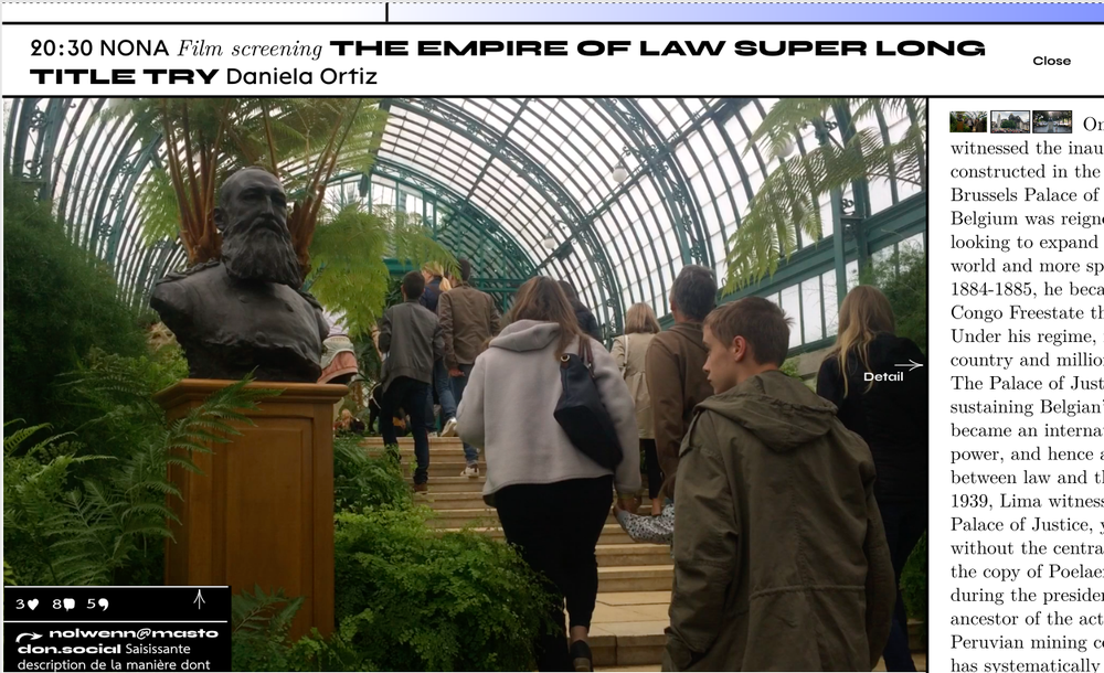