Download raw (6.0 KB)
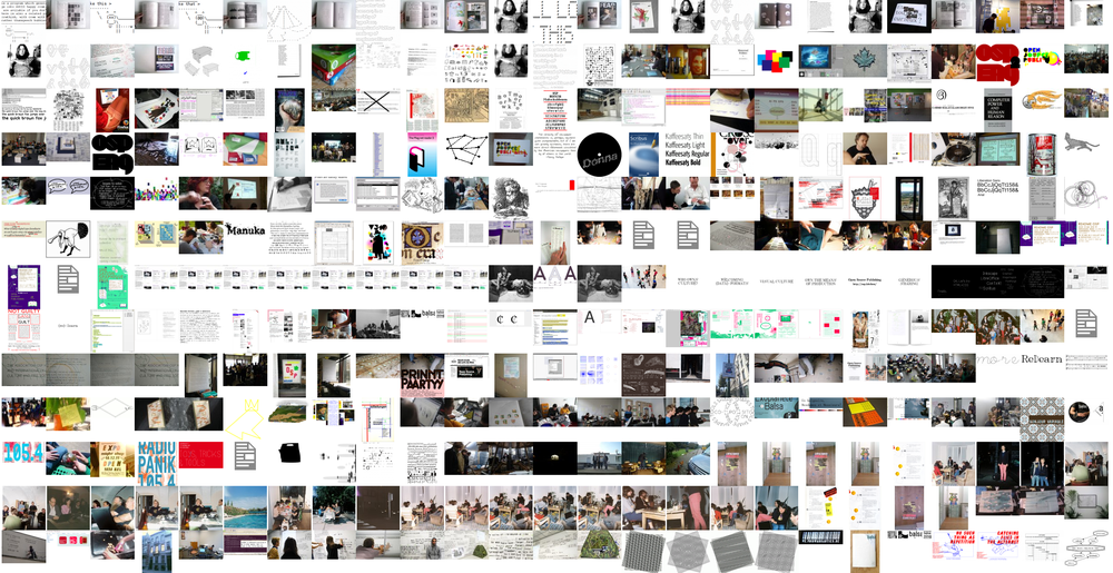
Title: DIN 4
Date: 2008-03-31 22:50
Author: Harrisson
Tags: Type, Berlin, DIN, Libre Fonts, Standards + Formats
Slug: din-4
Status: published

**Pandora's Standardised Box**

Kommando OSP Pierre and Harrisson spent a few days this February in
Berlin to explore the DIN project further.

<http://ospublish.constantvzw.org/image/index.php?level=album&id=10>

<!--more-->
The starting point was that we wanted to design an open format DIN font,
based on the original documents stored in the DIN archives.

While encountering books, people, and wandering in our minds away from
the DIN font core problematic of how to design such a font, more general
(and richer) questions arose: the idea of implementing a "standard",
public purpose fonts, and typographic design done by engineers.

This connects it to another thread going on in OSP: the question of
standardised (European) language and its representation.

**The DIN Archives**

The DIN font is deeply interlaced in German history. It is actually one
of its building stones. During this concentrated short stay in Berlin,
we opened a lot of boxes, and copyright issues are uncertain...

We were told that there were only few remains of old DIN documents,
before 1945, due to the fact that the building (located not far from
Postdammer Platz, were fights were particularly intense) was bombed 2
times. Still, there was enough documentation for us to fill holes in the
story.

Precious information was as well found in Albert-Jan Pool's essays
published in [ENCORE
MAGAZINE](http://www.magwerk.com/mag.php?magazine=encore&language=en&issue=13&page=32)
(No. 13,14,15,17 and 18). It seems that the designer of the massively
used "FF DIN", commissioned and distributed by FontShop, is currently
documenting a research that will eventually lead to an extention of the
FF family. This study left us with a lot of questions. For example, in
1949, the DDR started their own standard institute, written T (I don't
understand?) and re-taking the DIN number after (I don't understand?),
It seems there has been contact between the institutes. For that reason,
an East German version of the DIN font was developed, but what are the
rights for this?

DIN rights are not clear to us. We thought it was public domain, but it
seems there is a misunderstanding on terms - even if this would logical
for a standardisation to spread. We bought 2 sheets of DIN font
specification, but we are not sure what we have the rights on with those
sheets: the rights to use the font? Access to the know how? Those
questions were raised after our RAID visit to the very interesting and
wealthy DIN Museum, where everything is DIN, from staples (DIN 1) to
coffee cups or... schnaps!

By the way, what used to be the DIN library, has been transformed into a
Print On Demand workshop.

**Engineer fonts**

Encountering the question of standardisation of typography, we couldn't
ignore the proposals of other countries in their efforts to homogenize
systems such as highway signage or normalised national industry
references.

This lead us to "National Fonts", and more specifically to signalisation
fonts used across Europe. It is amazing to see that the field of road
signalisation is often were typography and engineers meet:

We are looking for infos about Swiss and Belgian "Alphabet" 1 to 6
current highway signalisation font, apparently designed by the American
3M company, and imported in Europe via the Marshall Plan.
Seeing strong simultaneities between Bauhaus fonts \[what fonts?\] and
the 3M version, we would like to know if there is any relation between
them: is this font the result of engineer's mind or was it developed by
an expatriated Bauhaus student working in the US?

We are looking forward for infos about a Polish roadsigns font, and this
we might make the main subject of our next workshop we'll hopefully set
in May, in Wroclaw, Silesia, Poland at the occasion of the "Libre
Graphics Meeting 2008" .

Alexander Negrelli showed us a book by a letter painter from 1942 were
all fonts, fraktur as well, are structured from a grid. Even the
strangest fonts are qualified under a serial number (picture).

The destiny of east German fonts is related as well to this subject.

> "Actually, in the strict sense of socialist thought and GDR tradition,
> the typefaces belong to the people and shouldn’t belong to any
> individual person."

<small>Extract from interview of Karl-Heinz Lange, major font designer
of VEB Typoart
<http://pingmag.jp/2007/10/05/veb-typoart-the-east-german-type-betriebsstatte/></small>

Fonts in the DDR were designed for a central company, apparently in
Dresden - VEB Typoart. All the rights seems to be attributed to this
Konglomerat. In 1989, after the Wall fell, those fonts were bought with
the company, with the building... in a solid state investment. The
companies were bought and re-bought until Mr X. got hold of it. Soon
after the deal, Mr X had trouble with justice for fraud, and he flew
away. No one knows now where the owner of the entire patrimony of
former-DDR fonts is right now.
<http://en.wikipedia.org/wiki/VEB_Typoart>

The [Maxima](http://www.myfonts.com/fonts/urw/maxima) font is currently
owned by URW++.

Some of Berlins' public signage was digitalised by FontShop:
[FF City Street
Type](http://www.fontshop.com/fonts/downloads/fontfont/ff_city_street_type/)

The thing is that it seems that there are 2 societies from the city
doing signages, from the previous east and west part. Those 2 workshops
are still in use, but not with exactly the same specifications, thanks
to old systems of reproduction such as silkscreen.

To be continued!

<small>Thanks to:

[**Raoul
Sanders**](http://www.sekundaerschleife.de/impexunlimited12/impex1-1.htm)
for the research-in-progress
**Alexander Negrelli** for helping us and sharing with us fleah market
typographic treasures.
**Arnaud Robin** for his hospitality, music and coffe support.
**Frederik Schikowski** for his open ears.

The DIN Institute: Mr. **Peter Anthony** and the **Permanent Exhibition
Crew** for their serviceability and kindness.

We hope to continue collaborating with all of them</small>