This webpage is an interpretation and continuation of the printparty Up Pen Down, performed at Balsamine Theater as a part
of Saison des Cultures Numériques 2017. This performance was the first public moment of a research focused
on that which is between digital type design and bodies. Letters and movements, dance notation and programming,
digital codes and coded physical gestures, plotters and body parts interacted with each other and blured
the distinction between choreographic and digital practices.
During the performance a printed foldable was plotted. On this page we reinterpret and document the performance using recorded fragments and material from the research.
Cette page web est une interprètation et un prolongement de la printparty Up Pen Down performée au théâtre de
la Balsamine dans le cadre de la Saison des Cultures Numériques 2017. Cette performance était le premier
moment public d'une recherche située à la rencontre entre typographie digitale et corps. Lettres et mouvements,
notation de danse et programmation, codes digitaux et gestes physiques codés, plotters et corps ont dialogués
jusqu’à rendre cen fait onfuse la distinction entre pratiques chorégraphiques et digitales.
Pendant cette performance un dépliant a été dessiné. Sur cete page nous réinterprétons et documentons la performance avec des fragments de l'événément et de notre matériel de recherche.
Deze website is een interpretatie en vervolg van de printparty Up Pen Down, opgevoerd in het Balsamine Theater
als onderdeel van Saison des Cultures Numériques 2017. Deze performance was het eerste publieke moment van
een onderzoek in dat wat zich bevindt tussen digitaal letterontwerp en lichamen. Letters en beweging, dansnotatie
en programmeren, digitale codes en fysieke bewegingen, plotters en lichaamsdelen gingen het gesprek aan en
vervaagden de grens tussen choreografie en digitale praktijken.
Tijdens de performance werd een vouwvel geplot. Op deze pagina gebruiken we video-fragmenten en materiaal uit ons onderzoek om het proces the documenteren.
Dialogue
Pierre Maybe imagine a human having a perception of a vector for the first time: a pregnant woman walks
on the flat surface of a beach, to the background of the sunset. She hunts birds with a bow and an arrow. As
she bends the bow, she feels how its straight rope interacts with the sturdiness of the bones of her arm and
how the curved wood of the bow is in sync with the fibers of her muscles. All those straight and curved lines,
along with the soft arc of her thick belly, are also drawn by the sun as her shadow stretches on the sand. She
launches the arrow. The arrow itself could be seen as a vector-wave-movement. She also feels how rays of sun
project her transformed shape of her shadow on the sand, following another straight line. She looks more closely
at the border of the shadow, and sees the very moment where some grains of sand get lightened by the sun, like
many corpuscules-pixels-bitmap, envisioning in simultaneously the two main components of digital images, and
t two ways of describing tangible matter.
Pierre There are two matters within the digital, the molecular, which we recognise as bitmap and know
very well, and the ondulatory – the vectors. I want to not only utilise vectors, but also to go anthropological
about them. From that perspective I can tackle what is important in the aesthetics vectors create, beyond what
things look like and into the way they operate and influence our own operations.
Ludi I have the need to include the body in the investigation of digital typography, because through intimate
relations with vectors, we can trace back histories of writing that depended on the body and its movement.
Ludi The body has its own intelligence. When I put, for example, the tension of the curve into this awkward body,
some aspects of the digital practice become apparent in a way that I can't put the finger on, but I feel
that only the body can detect.
Ludi OSPies like dancing. But we do end up sitting on a chair when ever we deal with type design. Its
maybe a fantasy to think that such different modes of being could come together in an interesting way, but here
we are, using one practice to reflect on and activate the other.
Gijs With Metapost, the human becomes the choreographer and the machine is the dancer, interpreting and
improvising with the score.
Gijs Actually, a vector is a meta picture. Only when rendered it becomes a shape.
Adva So, could we say that vectors are like movements?
Gijs Yes, in this case the movement is a rendering device.
Adva Maybe both movement and vectors are potential, actualised through rendering processes, by the body,
by the machine, by anything they activate?
Pierre I find both dance and graphic design poetic practices, but sometimes I felt we killed their poetry
by forcing them to interact with each other.
Ludi We slowed the rendering process down so much in order to look into the process it facilitates. Maybe
that's what killed the poetry?
Adva I find poetry in the fact that we sometimes look at those technical processes through the perspective
of movement.
Gijs If you think of programming from the perspective of movement, for exemple loops, the time it takes
to execute the code, the electrons jumping, freezing, flowing, interacting through the processor - all become
interesting in a different way.
Adva I understood at a certain point that Up Pen Down is not a linear research, but rather an environment
we created for ourselves where methods, actions and questions we come up with can interact with pieces of art,
of knowledge, of completed or unfinished explorations of others within the field. Up Pen Down is for me more
of a place to be, than a well studied research question.
Adva By allowing different body practices to infiltrate one another, contemporary dance went through various
exciting waves of new discoveries about movement. At a certain point the body withdrew and the conceptualisation
of movement entered the field. I ask myself if there is something new to find about movement through looking
for it within digital processes and if yes, can it maybe generate a new way of thinking body and of making dance?
Adva I read once a Kabalah text about the letter . Sometimes this letter is used to indicate the name
of god. In that case, it should be written, but not pronounced. Its not because it represents god, but because
they believe that the letter itself, when written, contains divine power that is lost in the transformation through
the body from the written to the spoken. I like the idea of a letter carrying its own agency. This story is taken
from a mystical culture, but also on the more up-pen-downish level, we create texts, choreographies and technologies
that at a certain point become existing in themselves and start a relationship with us.
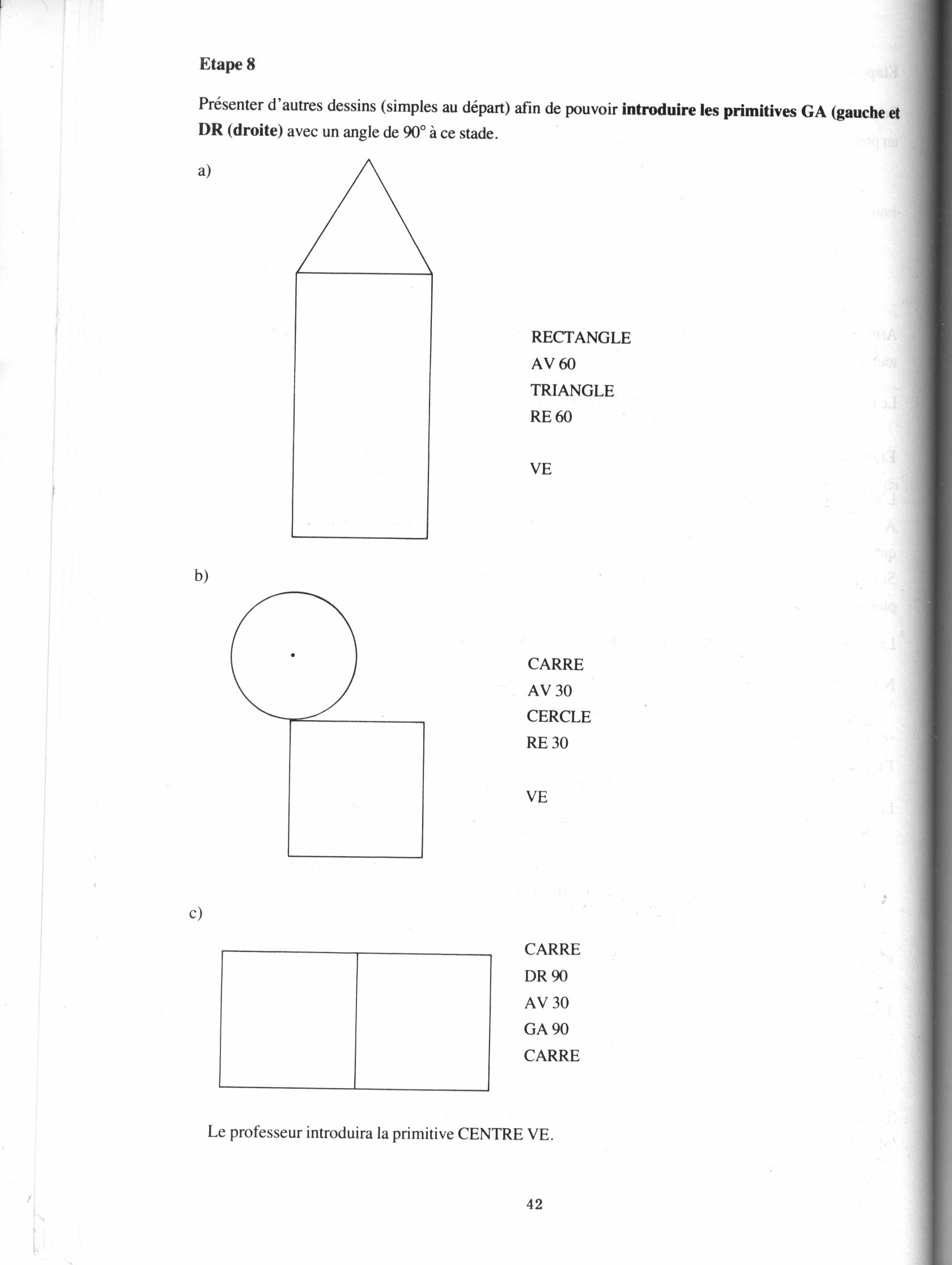
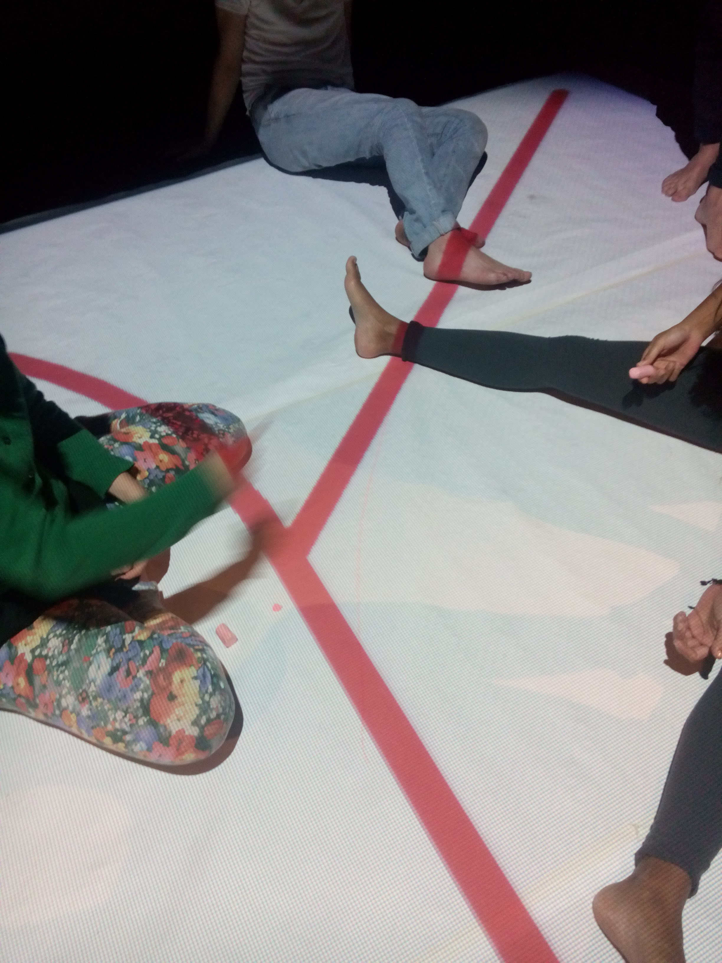
Drawing of the grid is the first element of the presentation. Developed as a group the scene start as the audience
is still coming in. Equiped with different coloured technical tapes, each one coordinates in solo or binomial
to place the different markers. The installation of the tape uses walking techniques inspired by the performance
of Esther Ferrer
[1] or measured movements, rolled developed for the occasion. In the background we listen to Laurie Anderson
- O Superman.
The grid has a proportion of 8 x 4 and allows us to overflow on the wall.
After placement of the grid by the bodies, light focus on the plotter who starts 'marking the territory'. One's
filming next to it so that the audience can see the pen trajectory, plotter's dance projected on the side
wall. On page 8, the grid is drawn.
.
Page 1 is the title page. This is where the plotter plot a simple dot. At the same time one person enters the
grid, marking a dot in the grid while announcing the coordinates and starting the introduction. This moment
marks the direct echo between the bodies and the machine. Space and language are transposed to the scale
of the body.
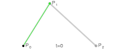
Line
Page 2 draws a same line following the 3 languages in action : hpgl, Logo and Metapost. Alternately the body
is the pen, the instructor and the interpreter.
IN; SP1; PA1,1; PD3,5; PU;
RT26.57;FD4.47;
beginfig(1);
z1=(1,1);
z2=(3,5);
draw z1--z2;
endfig;
end
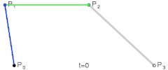
Corner
Page 3. The team gathers to fill boxes of the grid with chalk. Now the full body is a pen carried by a body that
plays the arm of the plotter. The hpgl plot of an angle appears in negative in the white space of the chalk.
Logo a été écrit pour les enfants. Né en 1966, c'es2t une méthode pédagogique et un langage de programmation qui la met en
pratique. Inspirée des recherches de Jean Piaget, Logo a été développé par Seymour Papert comme une initiation
à la la programmation et aux logiques numériques. Il passe par le dessin pour expliquer les concept d’unité,
d'échelle et de récursivité. Ce qui nous intéresse en particulier avec Logo c’est sa “Tortue”; sorte de robot
traçant piloté par de simples commandes: Pen Up, Pen Down, Forward & Rotate. Avec cette spécificité que la
tortue se déplace dans un environnement relatif.
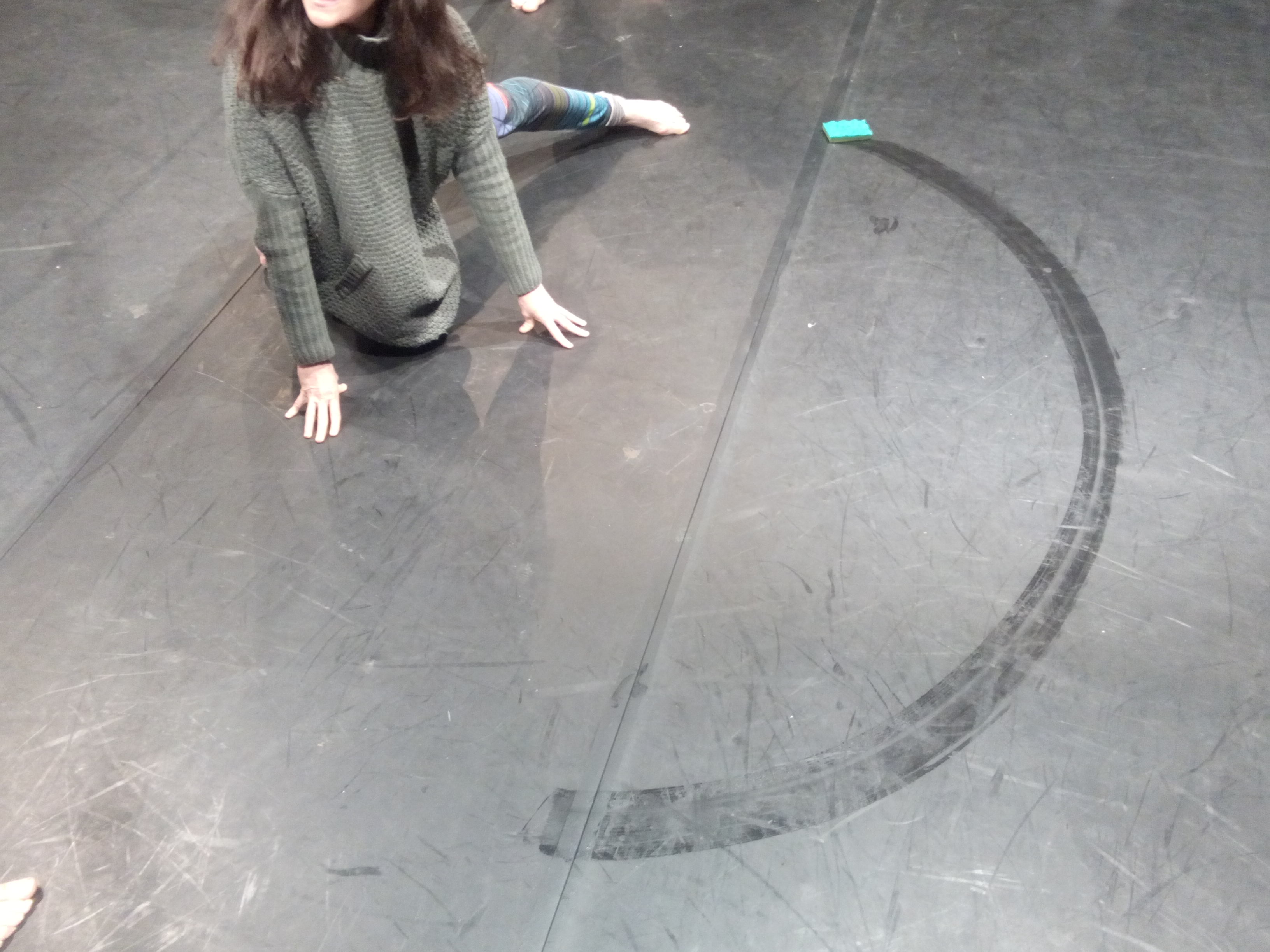
Circle
Page 4 deals with curves and the simplest application of them : circles. Three circles are performed simultaneously
starting as a canon and continuing in a loop. Each body performs the circle in a different posture and rhythm.
The 3 languages come into confrontation, bodies have here to take into account collisions. Riding on the
wall the Metapost circle meets the three-dimensional space of the stage. The path bumps into the folds of
the page.
HPGL or Hewlett-Packard Graphics Language, is a drawing and programming language to command pen plotters. It developed into
the industry standard and is still supported by contemporary devices. There are commands to send the pen
to a coordinate, or position on the paper and commands to put the pen down on the paper: Pen Down, or to
lift it again: Pen Up. If the pen is moving while it is down or on the paper the machine draws. There are
commands to modify the pen and commands to modify the machine, as in return to default settings, to change
the size of the paper or to pick a new one.
Ductus
Page 5 is the link with a more theoretical passage on the origin of our Latin ductus. The plotter superimposes
the evolution of the lines of the ampersand sign - from the capitales ET to the & - by following Jean Mallon's
documentary
Ductus.
We then retrace the historical relationships between E and ה.
Curve
Page 6 tells the specificities of the letter and bring us back to curves. Starting from a minimal straight plotted
version of the ה and the 3 points defining its upper right part, we play with curve tensions variations,
making legible the self initiative behaviour of Metapost dealing with curves. A dialogue between the indications
of Adva - only practitioner drawing this sign - the instructions and the projected drawing of Metapost is
played out.
Linguists say that the E, fifth letter of the latin alphabet, is derived from the Greek Epsilon E, represented in egyptian
hieroglyph by the rotated , and rotated again from the Phoenician that is rooted in two cuneiform letters
from the semitic script aged from more than three millenaries, the fifth letter haw meaning the window and
the eight letter heth meaning fence . In syriac and arabic, it gave a near rounded shape, and in hebrew the
mix between the latinesque cornered letter and a rounded one, even more rounded in cursive .
Improvisations
Page 7 introduces the Metafont "most pleasing curve" concept. That's when the programmer becomes a choreographer
and program itself is the 'dancer'. The plotter plot the ה with the rounded angle without direction, and
on top of it, with direction (intention).
Metapost is a drawing language based on Metafont, the language developed by Donald Knuth to design fonts. In Metapost the
drawing is deduced from a collection of mathematical equations. It is not obligatory but often the drawing
is split in two parts in the first half the points of the drawing are defined. In the second part the connections
between those lines are described, straight lines or curves and in which direction do they leave or enter
the point.
«Let's consider the following mathematical problem: Given n points z1, z2,..., zn in the plane, what is the most pleasing
closed curve that goes through them in the specified order [...] To avoid degenerate situations we may assume
that n is at least 4. This problem is essentially like the dot-to-dot puzzles that we give to young children.
Of course it is not a well-posed mathematical problem, since I didn't say what it means for a curve to be
"most pleasing". Let's first postulate soractice of the drawing of this sign,me axioms that the most pleasing
curve should satisfy. [... skipping mathematical properties 1 to 4 ...] Property 5 (smoothness) : There are
nothe hpgl plot of an angle appears in negative in the white space of the chalk. sharp corners in the most
pleasing curve. [...] In other words, there is a unique tangent at every point of the curve. Property 6 :
if z1, z2, z3, z4 are consecutive points of a circle, the most pleasing curve through them is that circle.»
Donald Knuth, "Mathematical typography", p. 355, in the Bulletin of the American Mathematical Society, Volume
1, Number 2, March 1979
Process path
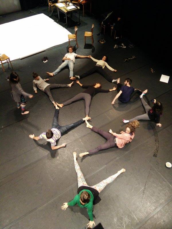
The research has developed itself in stages through several workshops over the the past two years. Reworking a workshop OSP organized to explore performative typography with graphic design students, OSP invited Adva Zakai as a professional performance artist, close to us.
2015 - Workshop Up Pen Down at la Balsamine theater during the “Quinzaine numérique”
Example of logo drawings code. Human grid as an excersice for collective drawing. Or the mapping of a path.
For this 2 day workshop OSP invited artist / dancer / choreographer Adva Zakai to reinterpret a workshop originially organised at xxxx Valence. And took as a starting point the relation between typographic movement and code. We started by executing simple commands or computer code ― walking on the lines a computer would have drawn. We quickly tried to develop movements through more abstract ways. In a exercice, movement rules were regulating the move of a groupe of people, in other each participant was inventing its own movement rules that other participants had to decode. Rapidly we developed a new game of coding and decoding.
2016 - Workshop Metahoguet at La Maison du Livre in the frame of the Saison numériques.
Hosted by La Maison du Livre a digital a typeface was drawn collaboratively using Metapost in a two day workshop. Metapost is a specialized programming language developed for parametric drawing. As letters were drawn using code rather than manipulating a preview through a graphical interface we could draw together live and simultaneously through a collaborative text editor, Etherpad. During the workshop this shared pad was projected in parallel with its graphical interpretation. This way all the participants could contribute with their letter(s) being aware of the evolution of the letters drawn by the others.
Linked up with this common screen; a *plotter* (pen tracer) allowing live drawing of the designed steps. These snapshots where exhibited so that visitors could feel the collective font process. Next to these snapshots specimens of the final font were drawn with a mural plotter during the opening of the exhibition.
Drawing collaboratively through code asked for a different process in considering shape.
2016 - Worksession at Buda (Courtrai), at OSP WTC and GC Ten Weyngaert (Forest)
In order to analyze and further the research started at Balsamine we organized three working sessions.
In the two first sessions in Buda (October 2016) and at WTC (January 2017), we looked back on the experiment at la Balsamine theater. Throughout our discussions we developped a common vocabulary and tried to precise our research scope. We identified three programming languages, each being able to describe or encode a drawing but all coming with their own approaches on how to desribe shape and motion. These languages were linked to approaches of movement we had developed to arrive at strategies of interpretation.
During the last session at GC Ten Weyngaert (January 2017) we invited two external guests, Louise Baduel and Sarah van Lamsweerde, to reflect on the work we'd developed and to find new insigts and directions to continue This last session helped us to realise how each worksession was preceded by exchanges on practices of the participants and that these sessions are crucial to establish a shared vocabulary and shared base of knowledge. The "lecture performance" we're organizing in Balsamine in October 2017 is for us a logical next step.
Session at Buda Kortrijk, with 3 Recipes for an 'R', drawn by the plotter, performed and exploration of the Bezier curve.
Session at WTC, excecuting the recipes in a grid.
Research session at GC Ten Weyngaret, with Sarah van Lamsweerde and Lousie Baduel.
Inventory
Dance notations
Besides the two schools of Laban and Benesh, we can mention other notation systems.
IN →initialize, start a plotting job
IP → set the initial point (origin), in this case the default 0,0
SC0,40,0,40 → allows scaling in millimeters since 1 mm = 40 plotter units. Each user-unit is 1 millimeter, in both X and Y directions
SP1 → select pen 1
PU0,0 → lift Pen Up and move to starting point for next action
PD100,0,100,100,0,100,0,0 →put Pen Down and move to the following locations (draw a box around the page)
PU50,50 →Pen Up and move to X,Y coordinates 50,50 (in this case mm, after the SC command)
CI25 → draw a circle with radius 25 (mm)
SS → select the standard font
DT*,1 →set the text delimiter to the asterisk, and do not print them (the 1, meaning "true")
PU20,80 → lift the pen and move to 20,80
LBHello World* → draw a label
LTlinetype,length → set line type and its repetition length
CSxx → set character set (e.g. 33 is German)
DIx,y → set direction of text given as the catheti
SIww,hh →set character width and height
Donald Knuth, The Concept of a Meta-Font, in Visible Language, issue 16.1, January 1982; traduction Le concept de métafonte, in Communication et langages, n°55, 1983, pp. 40–53
Donald Knuth, Lessons learned from MetaFont, in Visible Language, issue 19.1, December 1985
Gerrit Noordzij, The Stroke — theory of writing, Hyphen Press, 2006
Of the Just Shaping of Letters, Albrecht Dürer, traduction anglaise à partir de la version latine de Underweysung der Messung mit dem Zirckel und Richtscheyt, livre III
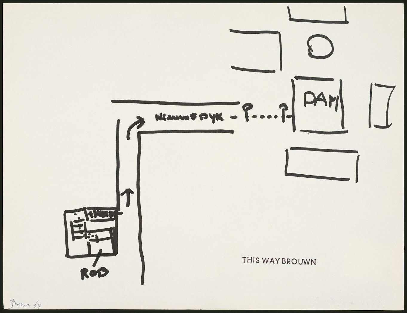
In 1960, Stanley Brouwn started This Way Brouwn serie, sketches of itinerary sketched by passers-by to whom he asks his way and where he then imposes his stamp.